Canada Feb 2013

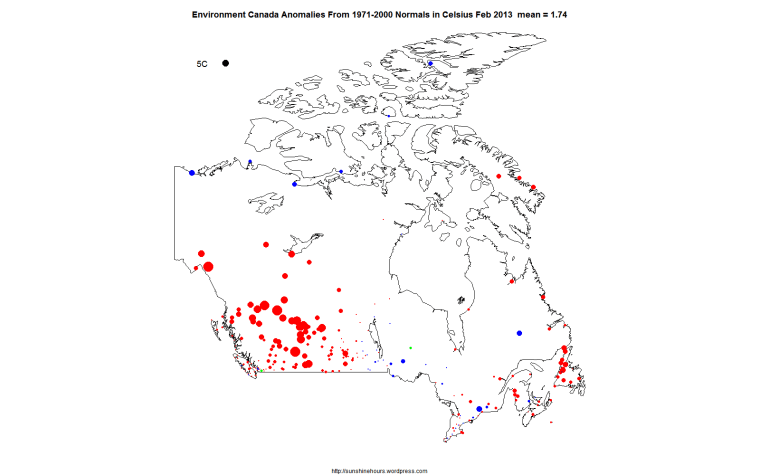
According to the Environment Canada “Normals”, Canada was warmer than the 1971-2000 average in Feb 2013.

The warmth was concentrated in the far west and the far east.

The middle was slightly warmer or slightly cooler. And the Arctic was mostly cooler than normal.

The anomaly map for Feb 2013 and an animated gif of Jan 2012 to Feb 2013. Click to make them bigger.

EC Normals 0x0 2013-02


EC_0x0_Map_Jan2012-Feb2013

Stop AGW – Try For 55% Unemployment Like Spain

Study: Global Warming Can Be Slowed By Working Less

“Want to reduce the effects of global warming? Stop working so hard. Working fewer hours might help slow global warming, according to a new study released Monday by the Center for Economic Policy and Research.

A worldwide switch to a “more European” work schedule, which includes working fewer hours and more vacation time, could prevent as much as half of the expected global temperature rise by 2100, according to the analysis, which used a 2012 study that found shorter work hours could be associated with lower carbon emissions.

The Center for Economic Policy and Research is a liberal think tank based in Washington.”

A “more European” work schedule???

Like Spain?

Spain unemployment rate hit a record: youth rate at 55%

Spain’s unemployment rate has hit a modern day record, and joblessness among young people has topped 55%.

Official data showed that the jobless rate in the last three months of 2012 rose 1% to 26%, or 5.97 million people.

The figure, the highest since the mid-1970s, follows Spain’s prolonged recession and deep spending cuts.Spain unemployment rate hit a record: youth rate at 55%

(h/t Tom Nelson)

Good News! Onshore Wind Turbines Will Slaughter Birds For Only 12 – 15 Years!

Good News. Wind Turbines will wear out a lot quicker than previously estimated. Which means the slaughtering of Eagles and other birds will be more expensive.

“The Renewable Energy Foundation today published a new study, The Performance of Wind Farms in the United Kingdom and Denmark, showing that the economic life of onshore wind turbines is between 10 and 15 years, not the 20 to 25 years projected by the wind industry itself, and used for government projections.

The work has been conducted by one of the UK’s leading energy & environmental economists, Professor Gordon Hughes of the University of Edinburgh, and has been anonymously peer-reviewed. This groundbreaking study applies rigorous statistical analysis to years of actual wind farm performance data from wind farms in both the UK and in Denmark.

The results show that after allowing for variations in wind speed and site characteristics the average load factor [performance] of wind farms declines substantially as they get older, probably due to wear and tear. By 10 years of age the contribution of an average UK wind farm to meeting electricity demand has declined by a third.

This decline in performance means that it is rarely economic to operate wind farms for more than 12 to 15 years. After this period they must be replaced with new machines, a finding that has profound consequences for investors and government alike.”

(h/t The Hockey Schtick)

Wind turbine collapses in high wind

Would you want your hospital reliant on wind turbines that can’t handle 50mph gusts?

“A 35-metre turbine has collapsed near Holsworthy leaving the tower lying on the ground. The turbine at East Ash Farm in Bradworthy was erected in 2010 by Dulas Ltd. Dulas confirmed this morning that an “incident” had occurred with the turbine and said the situation is currently being investigated”


Canada 2012 – Anomalies Mapped

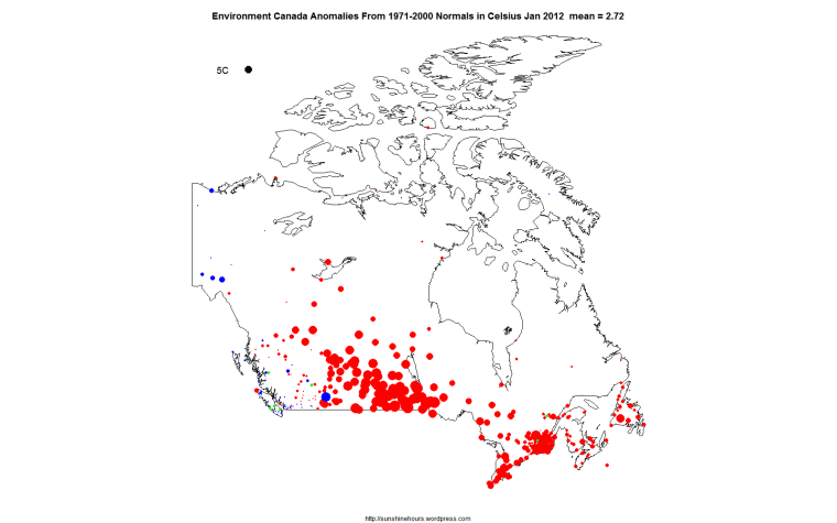
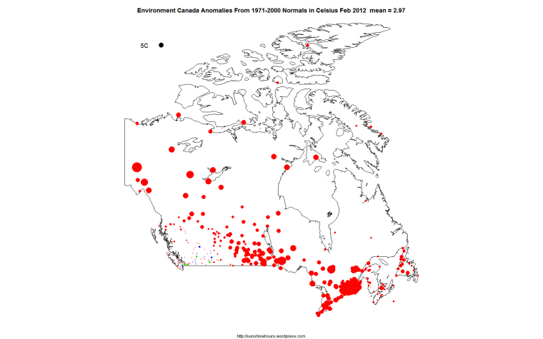
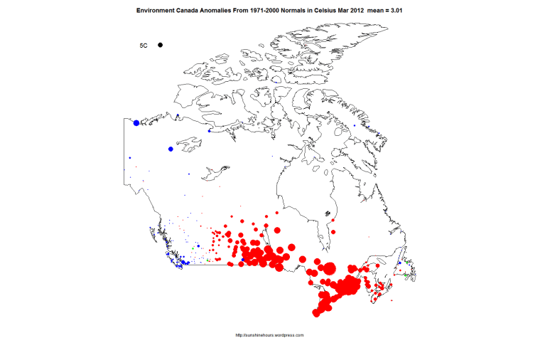
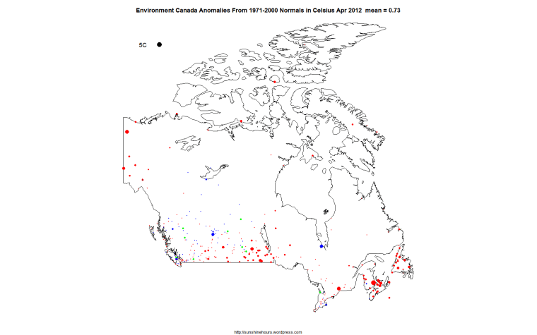
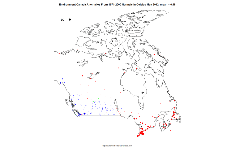
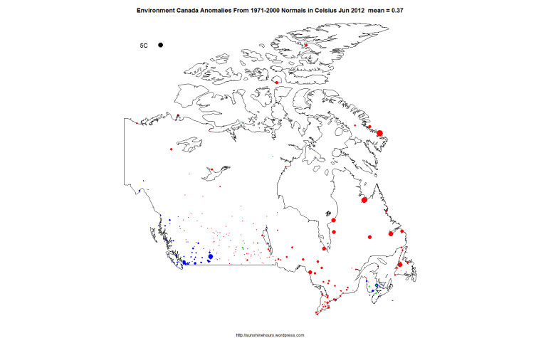
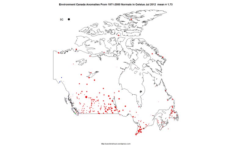
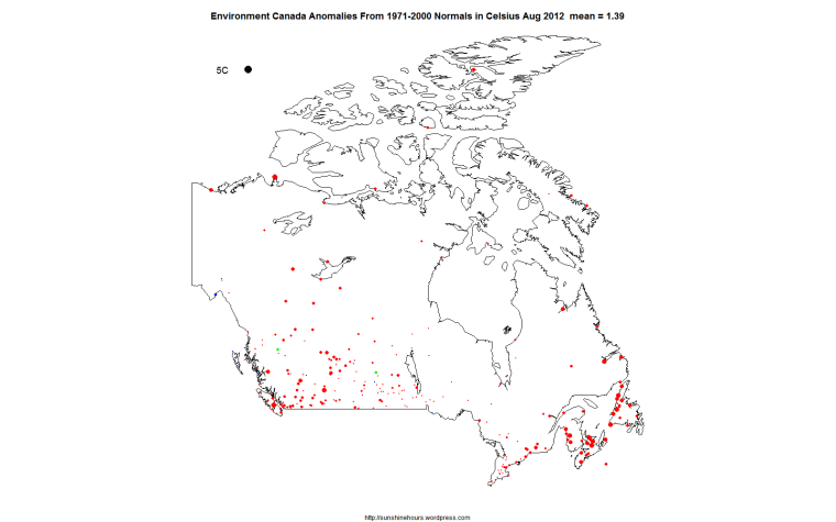
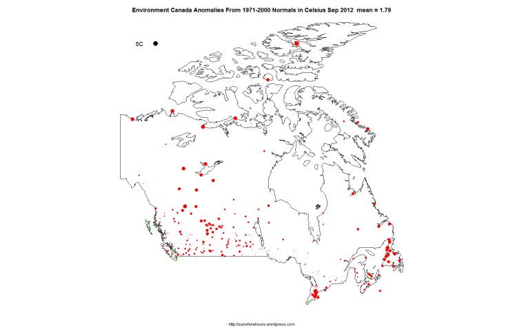
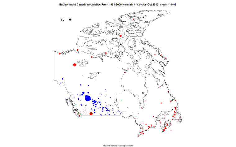
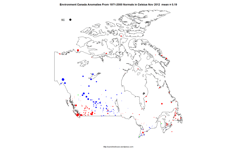
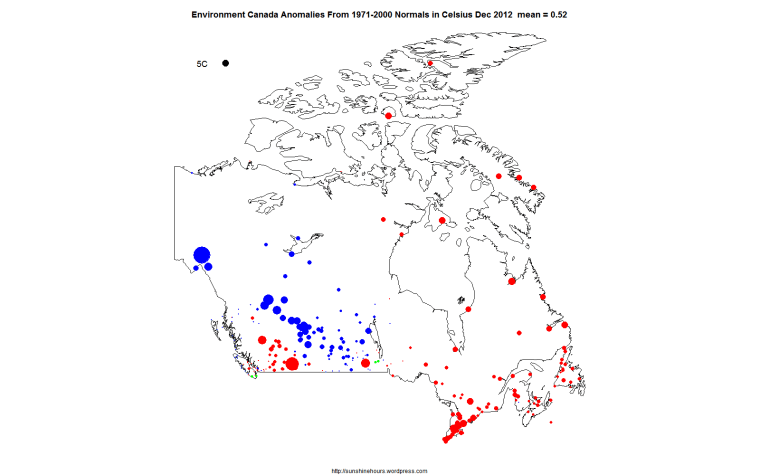
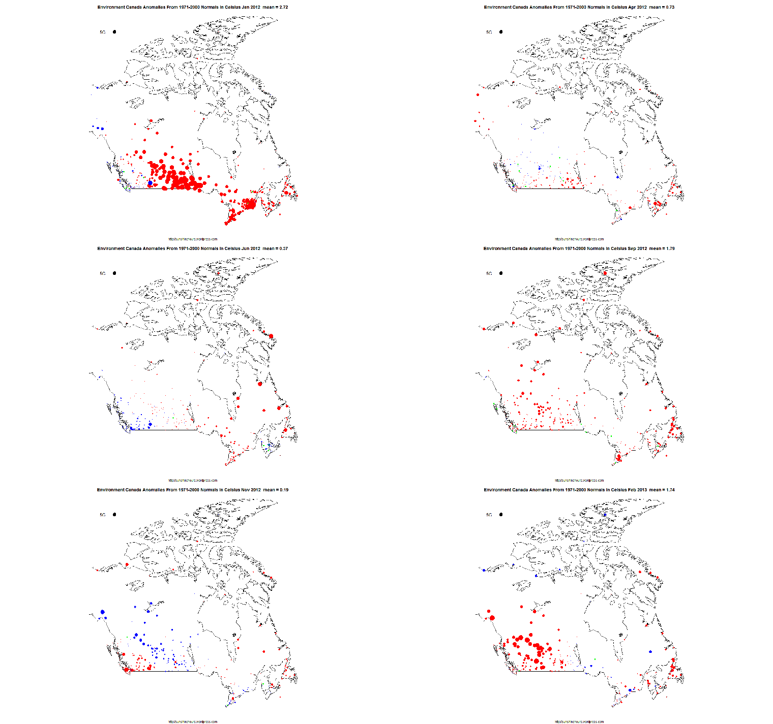
I have mapped the anomalies in the Environment Canada monthly summaries that have “normals”. The anomalies are calculated from selected stations based on the 1971-2000 average.

The 5C black dot in the top left hand corner represents 5C difference from “normal”. Red dots are warmer than normal. Blue are cooler. And Green are 0.

March April and May are really close to normal (all the dots are small). Other months have extremes. October is colder than  normal. March is really interesting for having no red dots in the Arctic which means below normal temperatures which has not been true for years.

There is an animated gif at the bottom showing all months of 2012.

EC Normals 0x0 2012-01 EC Normals 0x0 2012-02 EC Normals 0x0 2012-03 EC Normals 0x0 2012-04 EC Normals 0x0 2012-05 EC Normals 0x0 2012-06 EC Normals 0x0 2012-07 EC Normals 0x0 2012-08 EC Normals 0x0 2012-09 EC Normals 0x0 2012-10 EC Normals 0x0 2012-11 EC Normals 0x0 2012-12 EC_0x0_Map

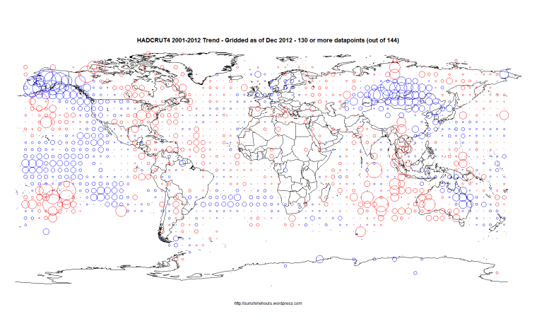
HADCRUT4 – Gridded 12 Year Trends – Freezing In Alaska and Mongolia and Australia

HADCRUT4 for the last 12 years shows a small amount of cooling. The following map shows which 5×5 grid squares are warming or cooling. I am using grid squares with 130 out of 144 possible datapoints for the period. The circles are proportional to the trends.  Keep in mind that this is 5×5 grids squares. As I’ve shown for Canada different size of grid squares change warming to cooling.

HADCRUT4_DEC_2012_12_Years

Kyoto Has Saved The World!

Kyoto was not a failure. The CBC are being pessimists.

The controversial and ineffective Kyoto Protocol’s first stage comes to an end today, leaving the world with 58 per cent more greenhouse gases than in 1990, as opposed to the five per cent reduction its signatories sought.

From the beginning, the treaty that was adopted in 1997 in Kyoto, Japan …

Lets connect the dots. Warming stopped in 1997. Kyoto was adopted in 1997. CO2 is up 58%. Signing the Kyoto has stopped global warming. More CO2 is irrelevant. The very act of creating a treaty stopped the warming.


Kyoto has saved the world!

🙂

Dirty Truth About Wood-Burning Biomass

“Far from being “carbon neutral,” wood-burning biomass actually emits more carbon dioxide (the primary global warming greenhouse gas) per unit of energy produced than either gas or coal. Yes, trees can grow back and reabsorb that carbon, but that growth takes many years. The most recent studies show that

The renewability of wood is also questionable, as forests would be threatened by any meaningful increase in electricity generation using biomass as fuel. Replacing just 10 percent of the coal used in Pennsylvania would require more than 12.8 million green tons of wood per year — far more than the state’s annual commercial wood harvest (about 5 million tons).

Read more here.

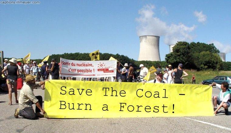
SaveTheCoal

Coral is fine and thriving

Coral has nothing to fear from CO2 (the Australian):

“A WIDESPREAD belief that the world’s coral reefs face a calamitous future due to climate change is proving less resilient than the natural wonders themselves.

Rising sea temperatures, storm damage and ocean acidification have grabbed the headlines as looming threats to reef survival.

But as each concern is more thoroughly investigated, scientists are finding nature better equipped to cope than they had imagined.

The latest research, published in Nature: Climate Change today, blows away the theory that reefs were doomed due to rising ocean acidification caused by the higher take-up of carbon dioxide in the seas.

Researchers have found a common coralline algae that grows at the leading edge of coral reefs is not nearly as susceptible to changing ph levels as coral because it contains high levels of dolomite.

In fact, the dolomite-laden algae has a rate of dissolution six to 10 times lower than coral’s.

The good news is that dolomite-rich coralline algae is common in shallow coral reefs across the world.

“Our research suggests it is likely they will continue to provide protection for coral reef frameworks as carbon dioxide rises,” the paper says.”
 

UK Tmax versus Sunshine are well correlated. Cleaner Air. More Sunshine.

This graph is Tmax % of normal versus Sunshine% of normal. The curved lines are the Loess curves from [R]. Data retrieved from here.

Why would sunshine be higher? Cleaner air in the UK (until China and India started to burn a lot more coal) thanks to the Clean Air Acts of 1956 and 1968.

The loess curves bottom out around 1968/1972.

UK Tmax vs Sunshine (Annual)_Tmax_Sunshine