Death Spiral in the Arctic Confusion – 2013 is 1,000,000 sq km Higher Than 2010

UPDATE: For this day, 2013 is closer to the maximum record than the minimum record.

Today’s ice extent is 11.48399 million sq km.


The minimum occurred in 2010 at 10.41433 million sq km – 1.07 million sq km lower than 2013.

The maximum occurred in 1981 at 12.38081 million sq km – .89 million sq km higher than 2013.

The Arctic Sea Ice Death Spiral is confused in 2013. It is now running 1,000,000 sq km higher than the lowest area on this day in 2010.

Arctic_Sea_Ice_Extent_Zoomed_2013_Day_169_1981-2010

Canada May 2013 – Daily Mean Temperature Anomaly Map

Update: See bottom map for fun.

Using the stations in Canada with Environment Canada calculated anomalies, here is the month of May visualized using the mean temperature for each station for each day.

You might have to click on the image or refresh the page to restart it.

The black circle in the top left corner represents a 5 Celsius anomaly from the 1971-2000 average.

Blue are below normal. Red above.

DailyNormals_2013-05

I thought I would map just the stations that were exactly average just for fun:

DailyNormals0_2013-05

Canada May 2013 – Nunavut Daily Anomalies

Nunavut (northern Canada) was the coldest Province/Territory in May.

Environment Canada calculates “Normals” for a subset of stations. Those are the anomalies from the 1971-2000 average.

The following barplots are of the daily anomalies (TMax and TMin) for each Nunavut station (that have Normals) averaged together.

The coldest part of the month was 6 to 7C below the 1971-2000 average. So much for the overheating Arctic.

NUNAVUT - TMAX Anomaly From Normal Temperatures May 2013 NUNAVUT - TMIN Anomaly From Normal Temperatures May 2013

Antarctic Sea Ice Extent Set A New Daily Record on May 20

After setting 8 daily Antarctic Sea Ice Extent records earlier in the year, 2013 stayed near the top in 2nd, 3rd and 4th place until day 140 (May 20).

Another daily record was set yesterday breaking the old record set in 2000 by 66,000 sq km. 2013 is now in 6th place for daily records set.

Year No of Records
2010 129
2008 126
2006 29
2012 24
2007 21
2013 9
2009 8
2000 5
2004 5
1998 4
2005 3
1979 2
1980 1

Antarctic_Sea_Ice_Extent_Zoomed_2013_Day_140_1981-2010

Where is the Data? UAH, HADCRUT kind of late

2nd UPDATE: UAH is out. My post here.I knew if I complained it would all show up. 🙂

UPDATE: HADCRUT4 for March 2013 is out. My post is here.

Anyone know where the UAH and HADCRUT data is?

While some of the UAH data arrived a few days ago, the downloadable file is still missing April’s data. March’s data arrived April 2.

HADCRUT is usually available by the 28th of the following month. February’s data came out March 28. It is now 10 days late.

Are they having a conference? March and April too cold to explain?

RSS is out. HADCET is out. NCDC is due soon, but not overdue.

Canada April 2013 – Really, Really Cold in the Middle

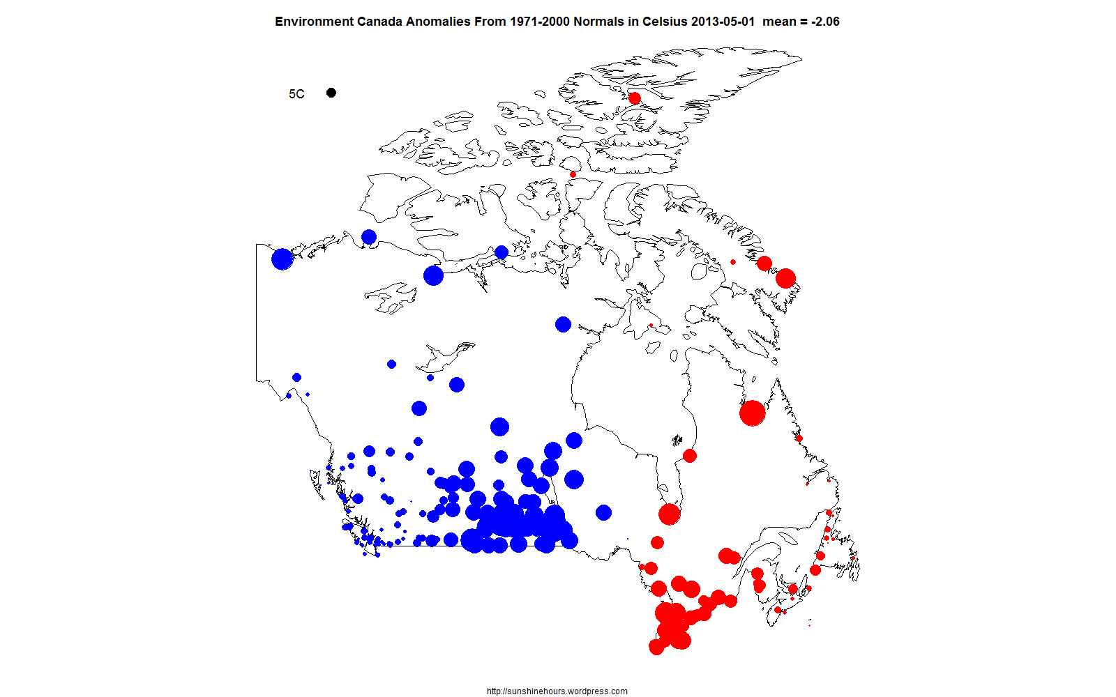
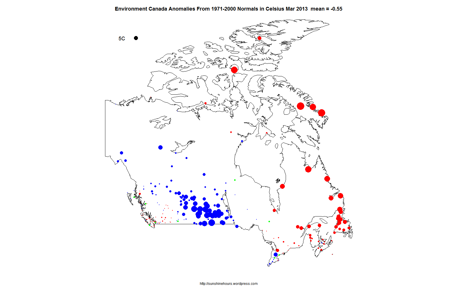
According to the Environment Canada “Normals” (the stations EC calculates anomalies for) , Canada was colder than the 1971-2000 average in April 2013.

The mean of all the “Normals” was -1.83C colder than 1971-2000 average.

If you look in the top left corder of the anomaly map and note the black circle represents 5C anomalies. Blue is colder than normal. Red is warmer.

The middle of the country was really, really cold. What little warmth there was, was concentrated in a handful of arctic stations.

And many of the stations had values too small to really show up on the map.

The anomaly map for April 2013 follows. Click to make it bigger.

EC Normals 0x0 2013-04

Where do I get the data? From Environment Canada monthly summaries.

The URL for April 2013 BC data is here. You can replace BC with nothing (PROV=) or SASK or MAN etc.

I use the data with a D column  value because EC calculates the anomalies for me. And because they are supposed to be better/long stations.

HADCRUT4 1930 to 1949 by Month – Dangerous pre-CO2 Global Warming

HADCRUT4 1930 to 1949 by Month.

Normally you see this part of the graph with 2 or 3 red ticks because it is done annually.

Keep in mind the highest red tick is an anomaly of 0.355C for August 1945. The anomaly for August 2012 was 0.532C. Which is only 0.177C warmer. (Corrected)

Click to see bigger.

HADCRUT4 1930 to 1949

Climate Science: The Constructing Explanations Phase

I was reading a transcript of an interview with Hans von Storch on P Gosselin’s blog today.

In terms of my understanding of what is going on in climate “science”, he really hit the nail on the head.

Q: Can the cause of the cold winters be identified?

HvS: One has to ask why are such explanations first found after the event appears.It indeed would have been much nicer if someone had said already in the year 2000: By the way, you have to expect harder winters in Europe because the Arctic ice is retreating in the summer. This claim today then would have been far more convincing. But it was the other way around: We noticed that something strange had happened, and then an explanation was constructed. Other explanations would also be possible.”

Bingo!!!

Climate Science in the 1980s and 1990s and 2000s made all kinds of predictions about coming doom and gloom. To use one example they predicted less sea ice at both poles. The problem for climate science is that Antarctic Sea  Ice grew! So what happened? Someone wrote a paper with a constructed explanation for why it happened (based on a joke of a climate model usually). There are dozens of other “explanations” that have come out recently to explain why there is more snow or less snow or more rain or less rain depending on which previous prediction existed.

What is really happening is that climate scientists are just making these explanations up because us “deniers” have been mocking them and making them look really really stupid. So scientists being well funded by the AGW industry have started constructing explanations to attack the deniers attacks on the old stupid obviously wrong predictions climate scientists made in the past.

So … we are now in the Constructing Explanations Phase of climate science. In essence they are trying to cover up their horrible predictions with bogus excuses.