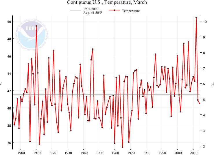
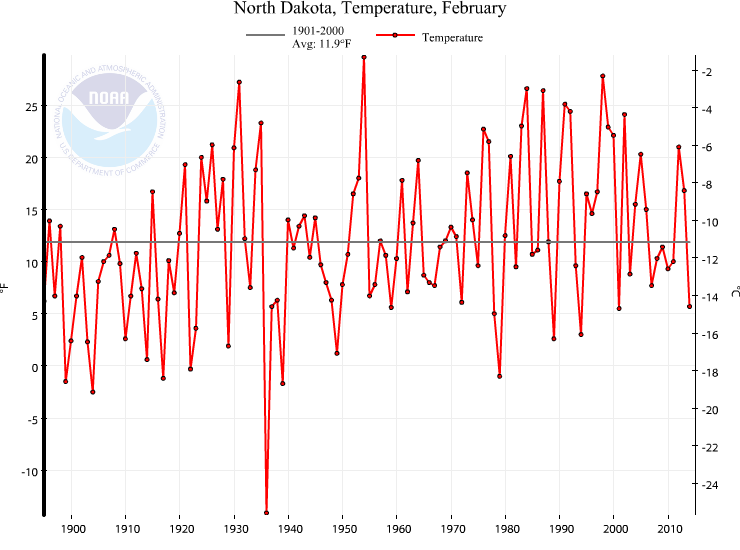
Over at Nick Stokes blog they are trying to tear down a graph used by WUWT and Steven Goddard. They have made a valid point that the last few skyrocketing points may be because of late data.
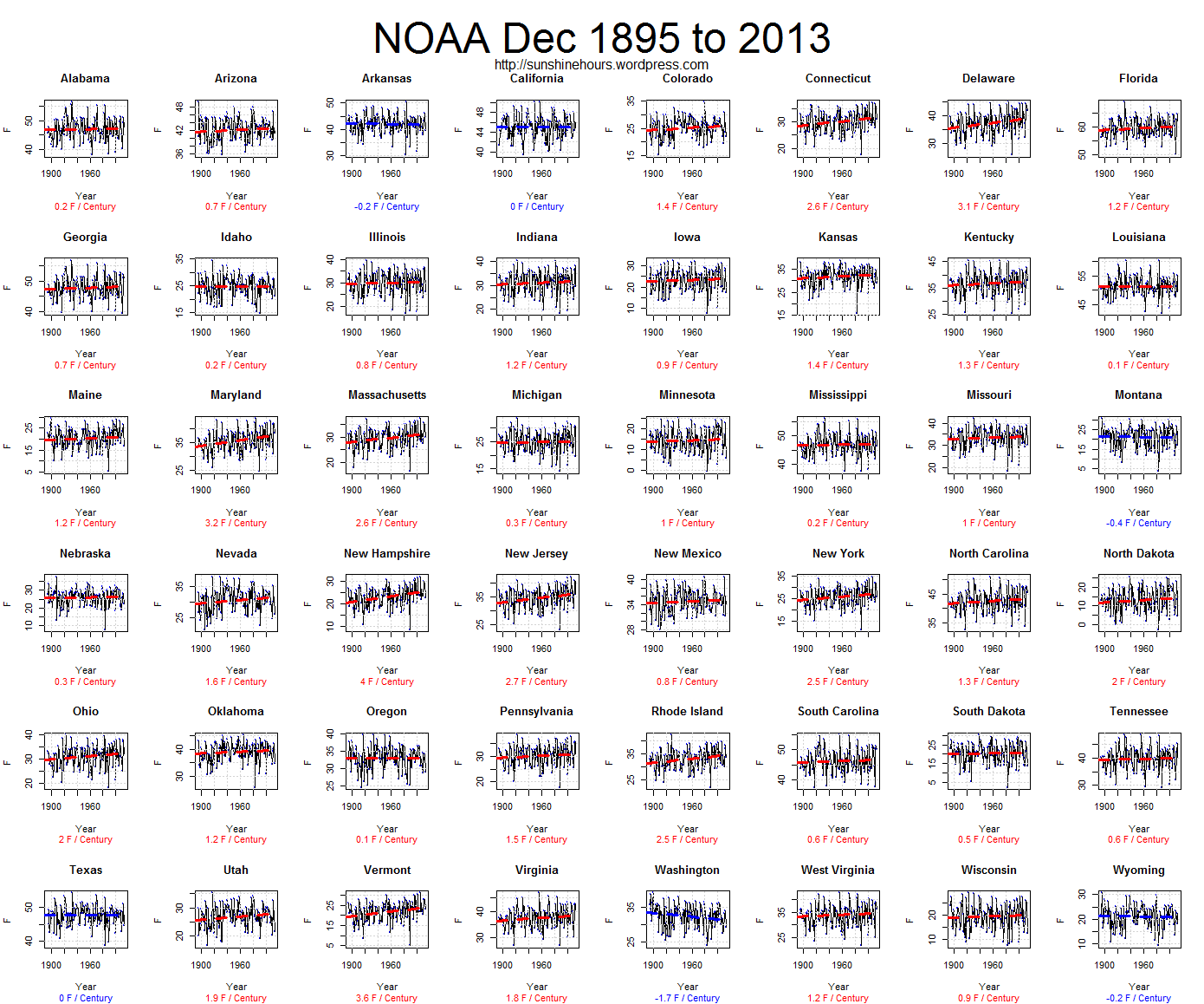
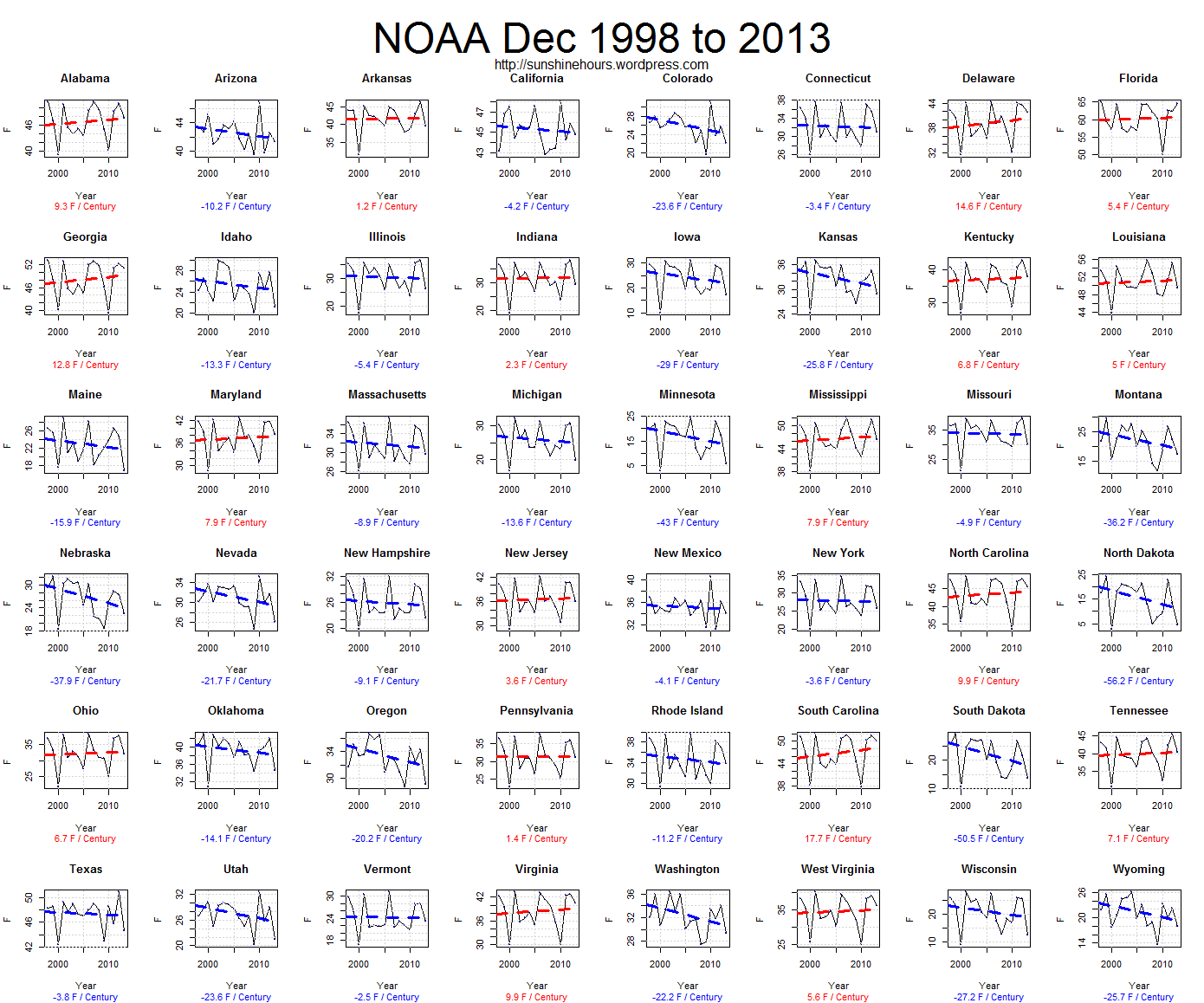
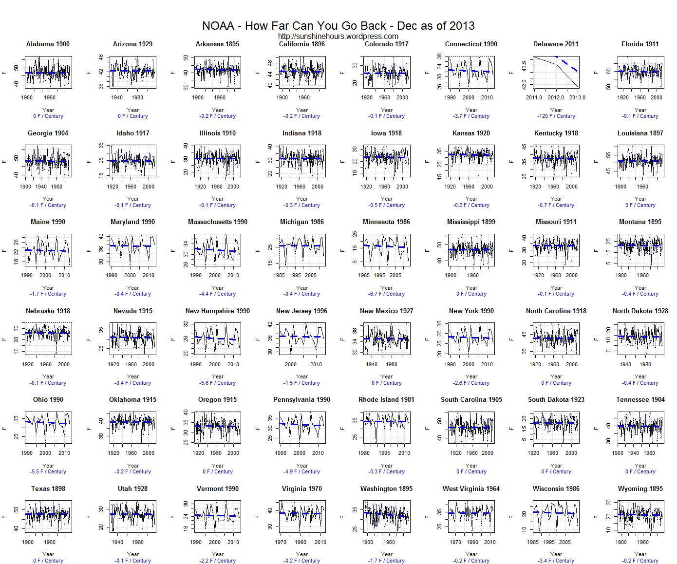
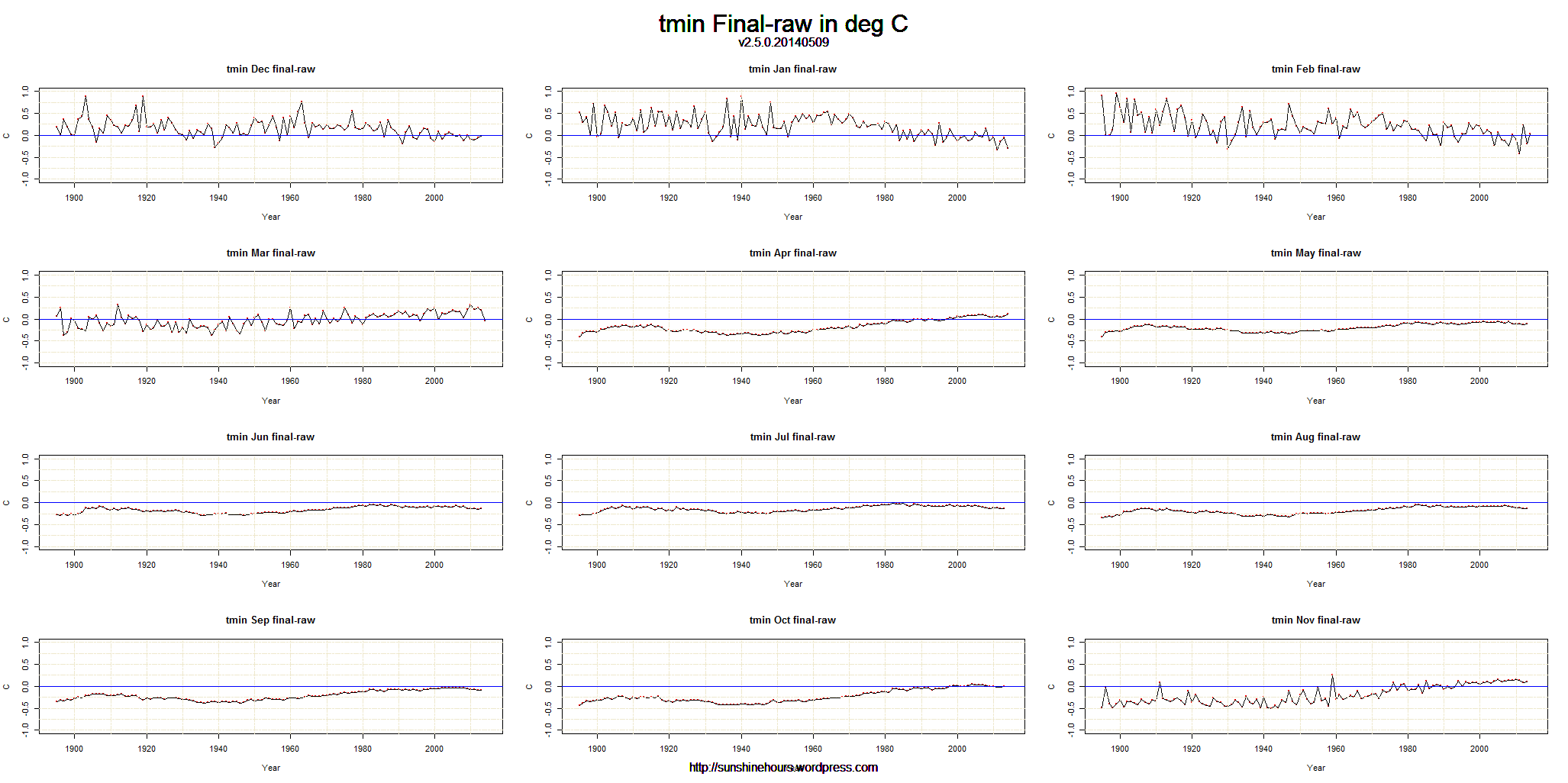
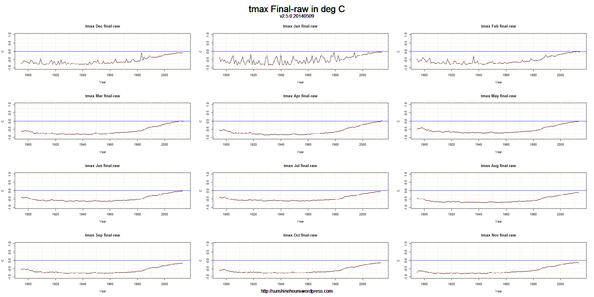
But I thought I would take a look at monthly adjustments to tavg, tmin and tmax. Each of these 3 graph sets show the Final Temperature minus the Raw Temperature.
1) As you can see the USHN adjustments cool the past (especially the warm 20s/30s/40s).
2) I don’t know why they adjust tmax so much.
3) I really, really want to know why Dec/Jan/Feb (and to a lesser degree Nov and Mar) are so heavily manipulated. The adjustments can change by .5C from year to year. Bizarre.
Click for bigger.

![cag_[ Statewide Temperature Anomalies (Feb 1936) ]](https://sunshinehours.net/wp-content/uploads/2014/04/cag_-statewide-temperature-anomalies-feb-1936.jpg)

![cag_[ Statewide Temperature Anomalies (Feb 2014) ]](https://sunshinehours.net/wp-content/uploads/2014/04/cag_-statewide-temperature-anomalies-feb-2014.jpg)
![cag_[ Divisional Temperature Anomalies (Mar 1910) ]](https://sunshinehours.net/wp-content/uploads/2014/04/cag_-divisional-temperature-anomalies-mar-1910.jpg)
![cag_[ Divisional Temperature Anomalies (Mar 2014) ]](https://sunshinehours.net/wp-content/uploads/2014/04/cag_-divisional-temperature-anomalies-mar-2014.jpg)
![cag_[ Divisional Temperature Anomalies (Mar 1934) ]](https://sunshinehours.net/wp-content/uploads/2014/04/cag_-divisional-temperature-anomalies-mar-1934.jpg)