Arctic Sea Ice 2013 – Where is the Death Spiral?

If someone claims Arctic Sea Ice is in a death spiral, you can mention that right now 2013 is the 7th lowest and not the lowest.

And that 2013 has even more ice than 1989 at this point in the year.

Lowest 7 = 2006 2004 2011 2007 1989 2005 2013

And that Extent is within one standard deviation of the 1981 – 2010 mean. And only 340,000 sq km below the mean which is about 2.5%.

Arctic_Sea_Ice_Extent_Zoomed_2013_Day_124_1981-2010


Canada April 2013 – Really, Really Cold in the Middle

According to the Environment Canada “Normals” (the stations EC calculates anomalies for) , Canada was colder than the 1971-2000 average in April 2013.

The mean of all the “Normals” was -1.83C colder than 1971-2000 average.

If you look in the top left corder of the anomaly map and note the black circle represents 5C anomalies. Blue is colder than normal. Red is warmer.

The middle of the country was really, really cold. What little warmth there was, was concentrated in a handful of arctic stations.

And many of the stations had values too small to really show up on the map.

The anomaly map for April 2013 follows. Click to make it bigger.

EC Normals 0x0 2013-04

Where do I get the data? From Environment Canada monthly summaries.

The URL for April 2013 BC data is here. You can replace BC with nothing (PROV=) or SASK or MAN etc.

I use the data with a D column  value because EC calculates the anomalies for me. And because they are supposed to be better/long stations.

I Smell A Rat at NSIDC – Earliest satellite maps of Antarctic and Arctic sea ice

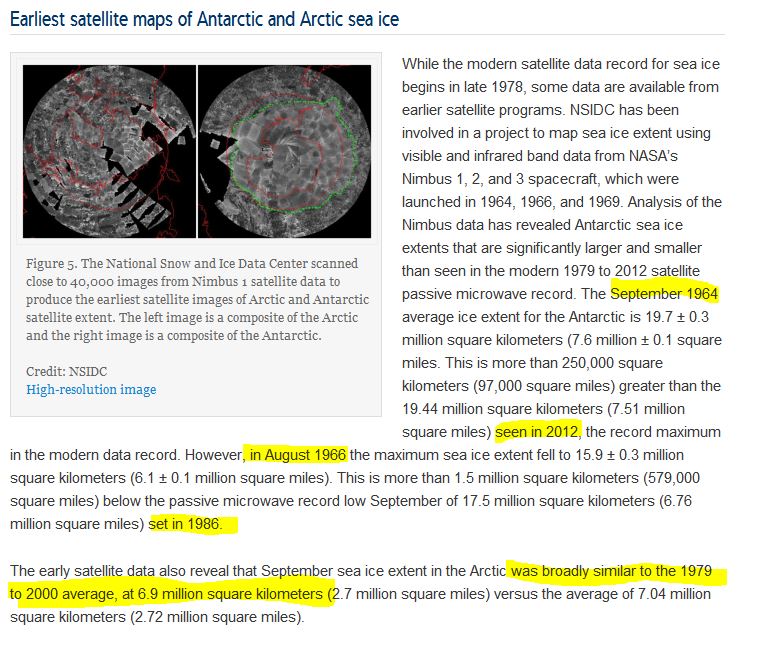
At the bottom of this post is a screen capture of an article at NSIDC concerning some early satellite pictures of the Arctic and Antarctic.

The article is titled “Earliest satellite maps of Antarctic and Arctic sea ice”.

Go ahead an read it at NSIDC (link) or in the screen capture.

Some things jumped out at me right away:

1) The Antarctic data is very specific comparing September 1964 to September 2012 and August 1966 to September 1986.

2) Why did they compare August 1966 to September 1986? The lowest average for August is 1986, but it was 17 million sq km, not 17.5 million.

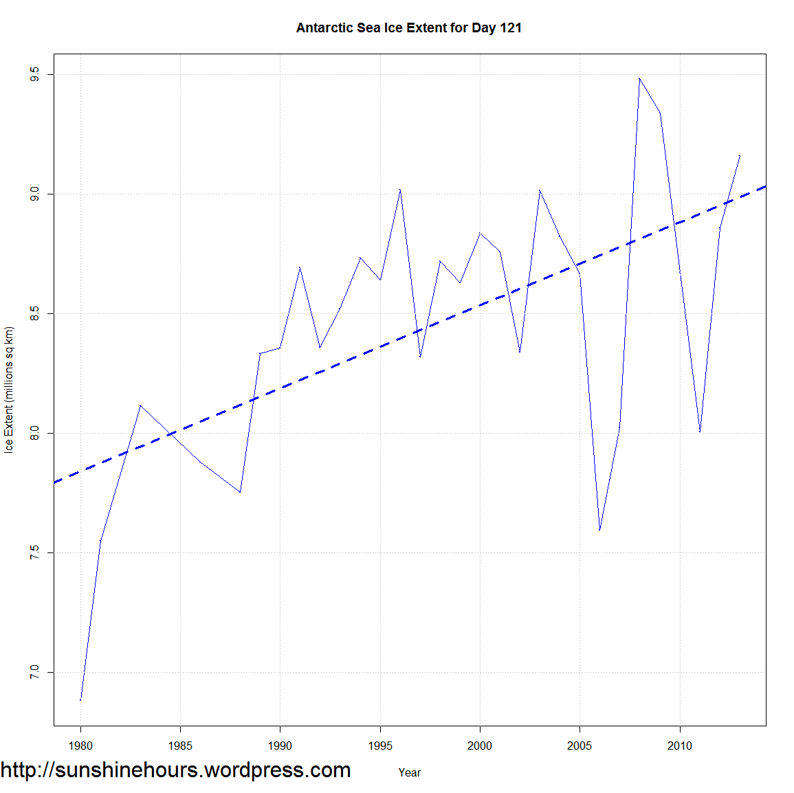
3) The 15.9 million sq km for August 1966 is 1.1 million sq km lower than the lowest “modern” mean for August. Which means Antarctic Sea Ice has been growing since 1966 (at least in August).

4) Why are they so incredibly unspecific about the Arctic? “early satellite data” for September is compared to  “broadly similar to the 1979 to 2000 average”. Why not give values for specific years?

5) 6.9 million square kilometers for some September in the 1960s would be 700,000 sq km lower than the highest Arctic Sea Ice which occurred in 1980. Isn’t that evidence of Arctic Sea Ice being cyclic?

6) I smell a rat. Why so ambiguous about the years in the Arctic? What are they hiding?

NSIDC_I_smell_a_rat

Arctic Sea Ice – April Trends – Last 10 Years Looking Ok!

I saw the following article at the NSIDC site about the trend for April Sea Ice Extent in the Arctic.

NSIDC_Arctic_April_2013

And I wondered what it would look like if I just graphed the last 10 years. And I thought … looking ok.

Arctic Sea Ice Extent for April Since 2004

And then I though … how about the last 20 years with a loess curve? Don’t you think the NSIDC articles words are misleading?

Arctic Sea Ice Extent for April Since 1994

Antarctic Sea Ice Day 121 Update

As you  know, Antarctic Sea Ice Extent hit a maximum record in September 2012. And since that news item finally received a little bit of publicity the AGW cult has come up with a few explanations for why ice is growing in the Antarctic.

For the heck of it I thought I would graph Antarctic Sea Ice Extent for the 121st day of each year. After I did that I had one obvious question.

Why, if Antarctic Sea Ice has been growing for 30 years, has it taken them so damned long to even admit it, let alone come up with such a weak-ass explanation that all sane people laugh at?

Antarctic Sea Ice Extent for Day 121

CRUTEM4 1851 to 1856 was Hot!

CRUTEM4 is the dataset put out by the Climate Research Unit as East Anglia.

Did you ever notice that the data for the Southern Hemisphere in the 1850s was really, really hot?

Like 2.9C warmer than 1961-1990 hot?

Here is a barplot of 1851 to 1856 and 2006 to 2013 mashed together so you can compare (click to make bigger):

CRUtem4 SH 1851 - 1857 and 2006 - 2013

Here is a table of the same data. Only one post-2005 monthly anomaly would make the top 20:

Year Month data1
1851 4 2.9
1852 12 2.9
1852 3 2.5
1852 11 2
1851 1 1.8
1851 2 1.7
1851 7 1.4
1852 4 1.4
1854 2 1.389
1852 6 1.3
1852 7 1.3
1851 10 1.2
1852 5 1.2
2009 8 1.106
1851 3 1.1
1852 2 1.1
1855 10 1.094
1854 6 1.047
1853 4 0.968
1855 3 0.909

Antarctic Sea Ice Extent Update – 2013 is the 2nd Highest Average Of All Time (So Far)

Update: This post has been updated to include 2011 which is was missing (due to dumbness on my part).

Antarctic Sea Ice Extent 2013 is the 2nd highest average to the same day (115)

2008 is still well out in front.

Year Anomaly (sq km)
2008 1,179,278
2013 745,503
2003 558,855
1995 538,814
2009 493,850
2012 464,446
2004 460,238
2001 423,453
1982 334,477
1996 292,814
1994 244,300
1979 237,085
1991 96,172
1987 67,523
1990 -26,984
1986 -27,273
2005 -37,556
2000 -81,299
1999 -82,009
2010 -93,560
1983 -134,642
1998 -148,875
1989 -256,004
2007 -286,537
2002 -305,094
1992 -306,598
1988 -352,354
1985 -388,609
1984 -406,363
1993 -443,665
1981 -591,105
1997 -592,872
2011 -621,510
2006 -737,201
1980 -746,627

Click to enlarge:

Antarctic_Sea_Ice_Extent_Zoomed_2013_Day_118_1981-2010

HADCET – March 2013 is tied for 12th coldest March Since 1659

The HADCET dataset is the longest instrumental record of temperature in the world.

One of the minor problems with HADCET is they calculate anomalies from the 1961-1990 average.

This is HADCET (March Only) with anomalies calculated from the most recent 30 years average: 1981 to 2010.

HADCET (since 1659) monthly mean - MAR

15 Coldest March’s (pretty ancient company)

Year MAR
1674 1
1785 1.2
1748 1.8
1883 1.9
1667 2
1845 2
1786 2.1
1789 2.1
1837 2.3
1747 2.5
1770 2.5
1784 2.7
1892 2.7
2013 2.7
1701 2.8

HADCRUT4 1930 to 1949 by Month – Dangerous pre-CO2 Global Warming

HADCRUT4 1930 to 1949 by Month.

Normally you see this part of the graph with 2 or 3 red ticks because it is done annually.

Keep in mind the highest red tick is an anomaly of 0.355C for August 1945. The anomaly for August 2012 was 0.532C. Which is only 0.177C warmer. (Corrected)

Click to see bigger.

HADCRUT4 1930 to 1949