There is a big kerfuffle about the billions of disposable coffee cups thrown away when people drink coffee out.
If you care about the environment:
Make Coffee At Home!
Put it in a thermos!
Wash the non-disposable cup when done!
There is a big kerfuffle about the billions of disposable coffee cups thrown away when people drink coffee out.
If you care about the environment:
Make Coffee At Home!
Put it in a thermos!
Wash the non-disposable cup when done!
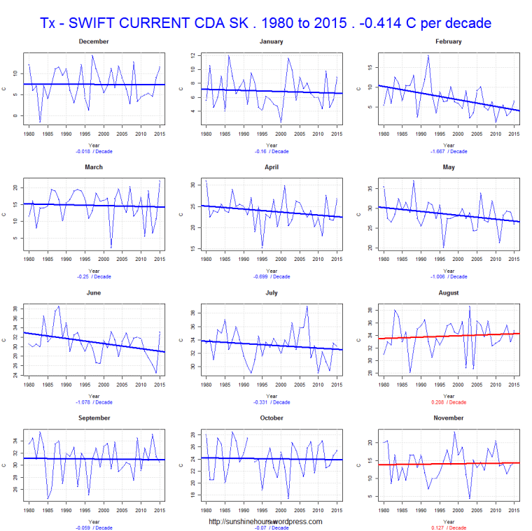
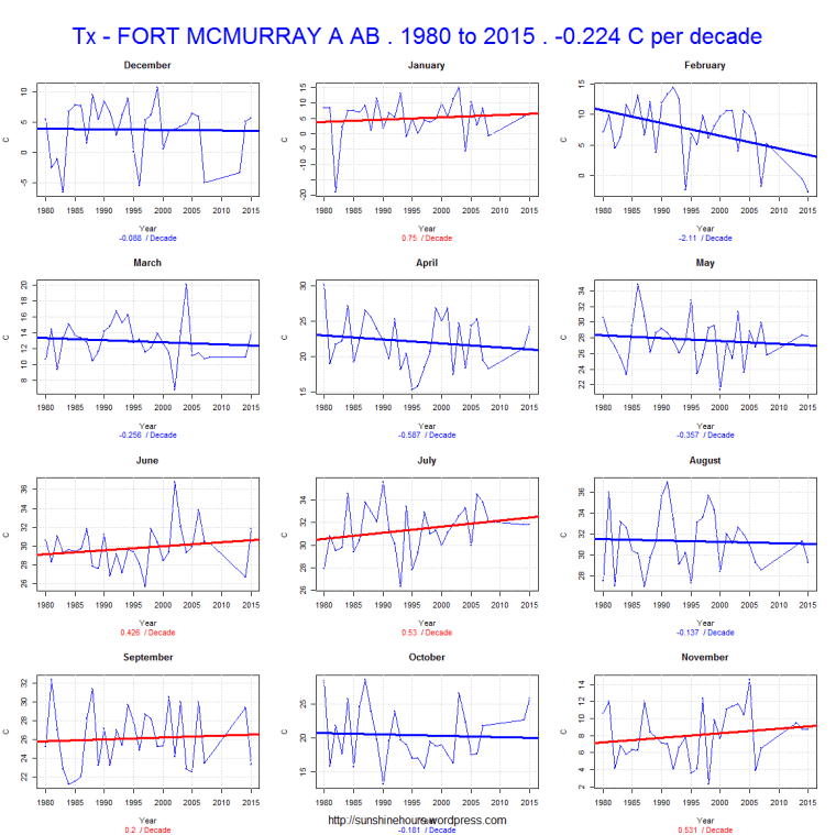
A few days I published 10 more randomly chosen graphs of TMAX using Environment Canada’s monthly summaries.
I was fiddling with the graphing code to add the overall rate of temp change and color the title – red for warming and blue for cooling.
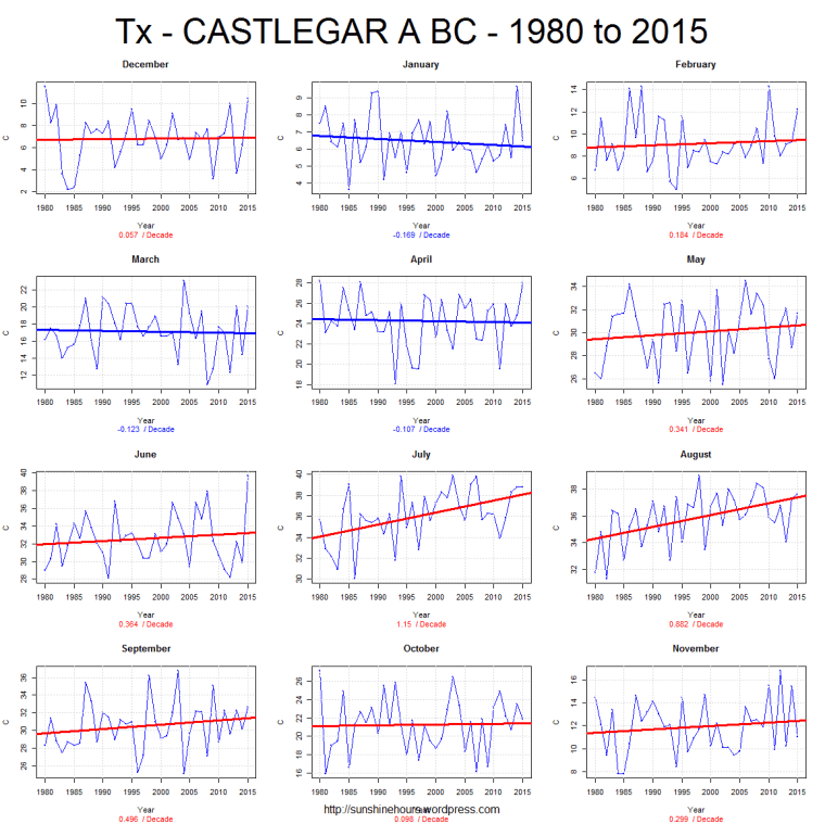
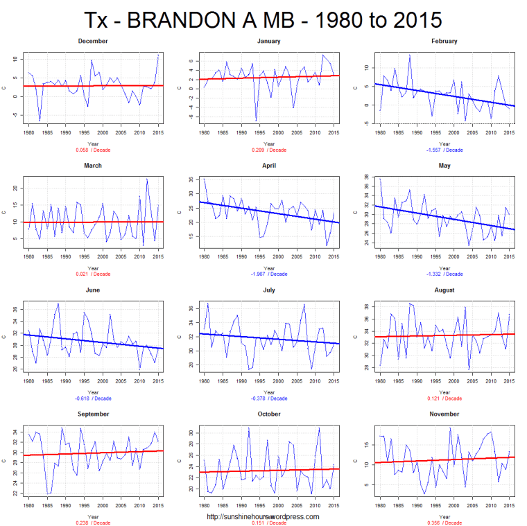
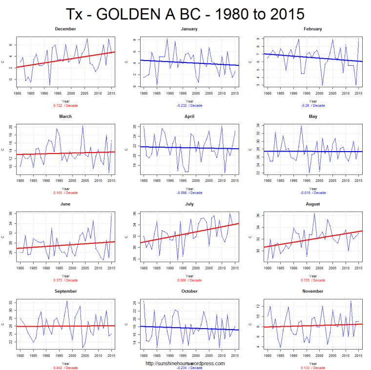
I took a closer look at 3 stations (2 are airports).
Tmax temperatures falling at -.414C /dec, -.224/dec and -.246/dec
April Tmax in Brandon have fallen 7C in 35 years.

A few days I published 10 randomly chosen graphs of TMAX using Environment Canada’s monthly summaries.
I picked 1980 to 2015 partly to create a round number and partly because that is sort of when AGW became noticeable.
I picked TMAX because I think TMIN’s are rising because of UHI.
The red lines indicate a warming trend. The blue a cooling trend.
Anyone see evidence of CO2 making it warm?
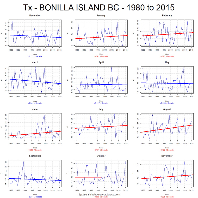
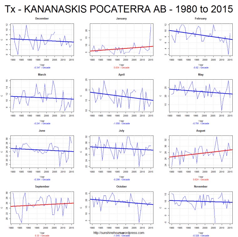
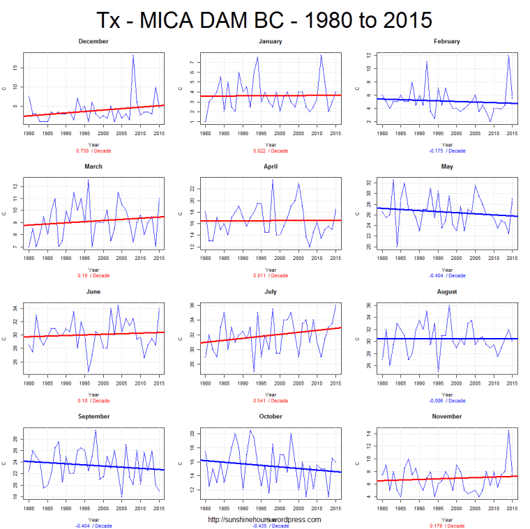
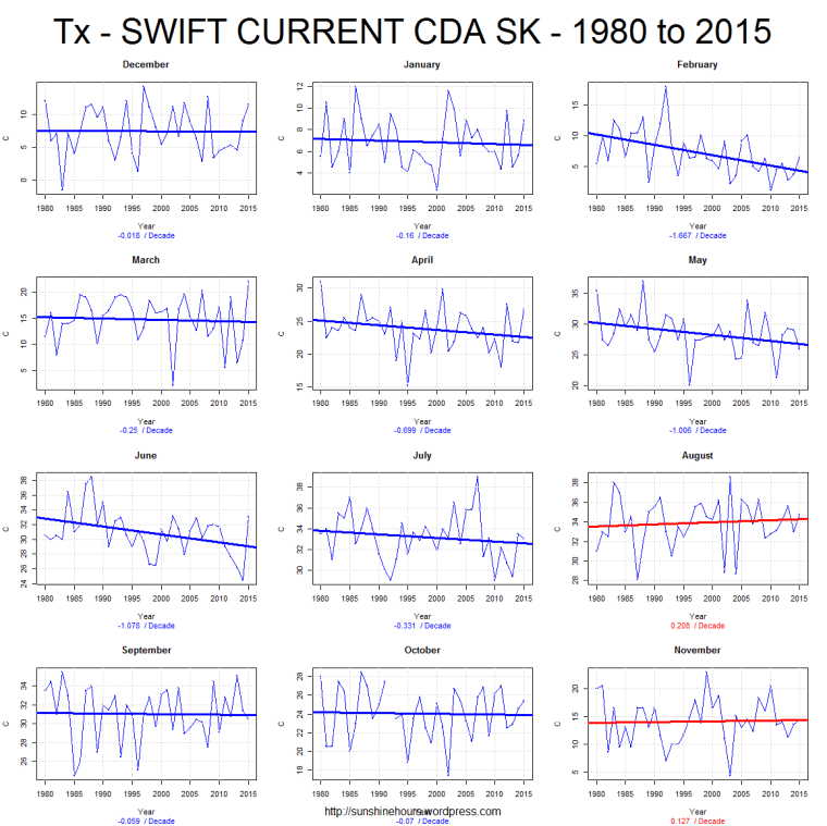
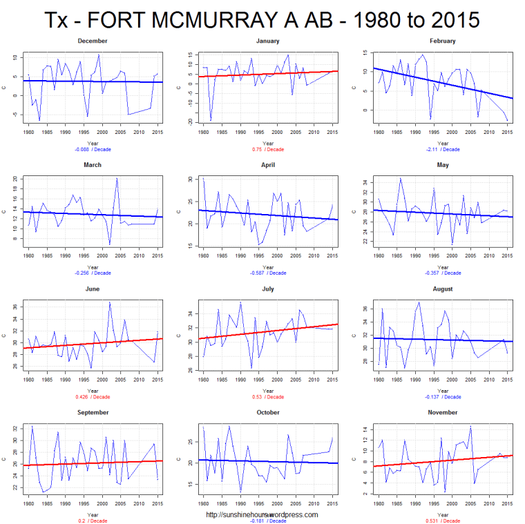
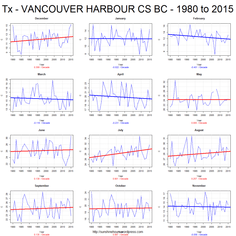
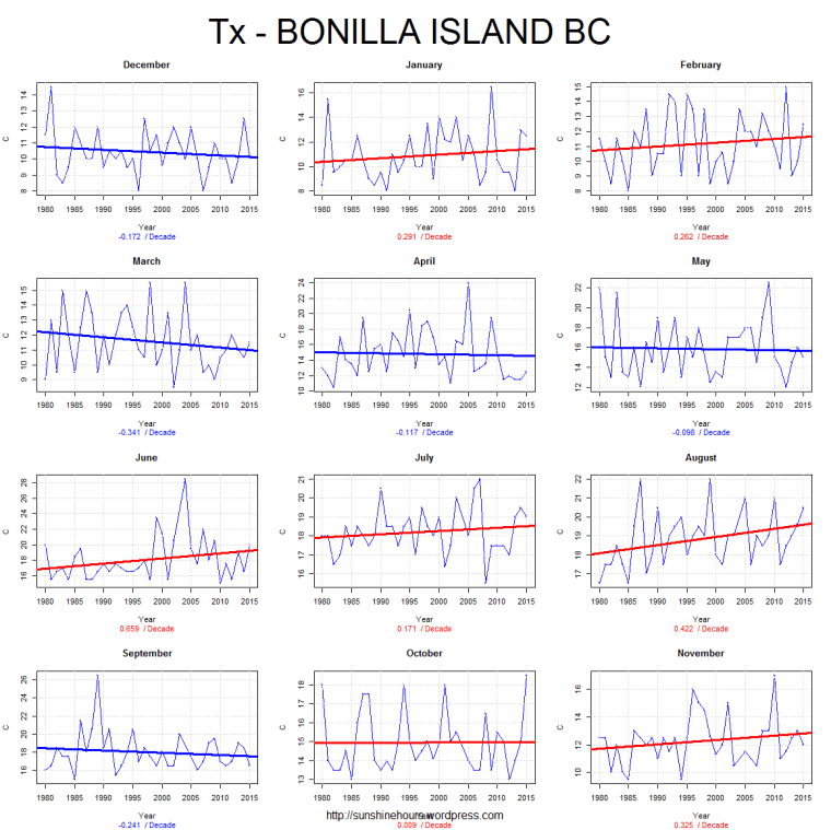
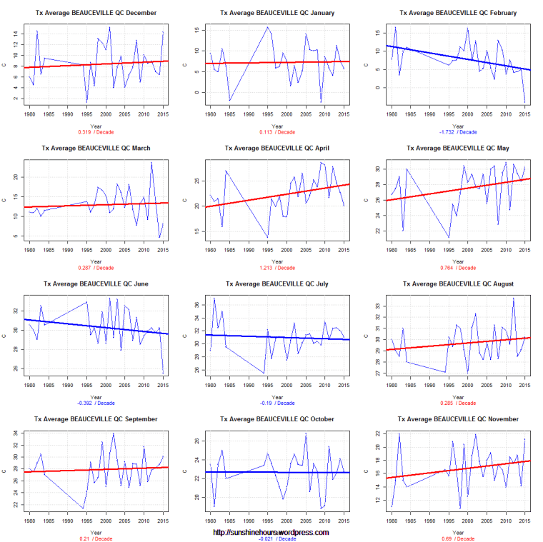
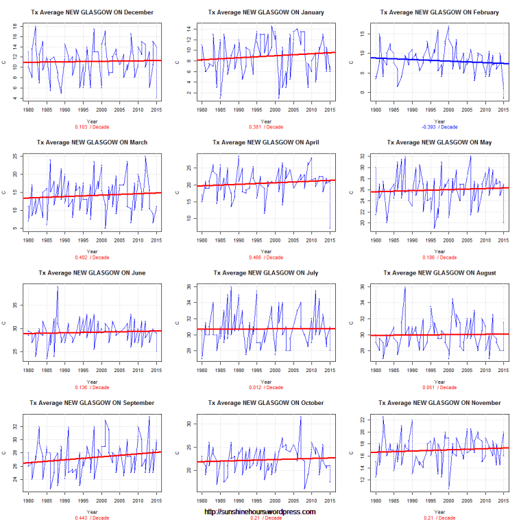
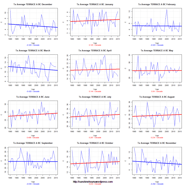
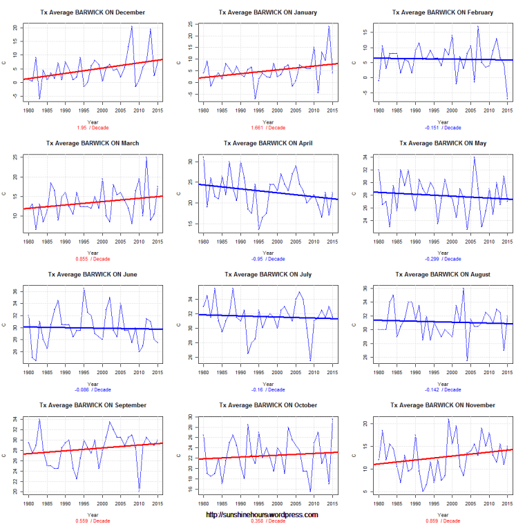
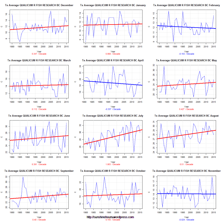
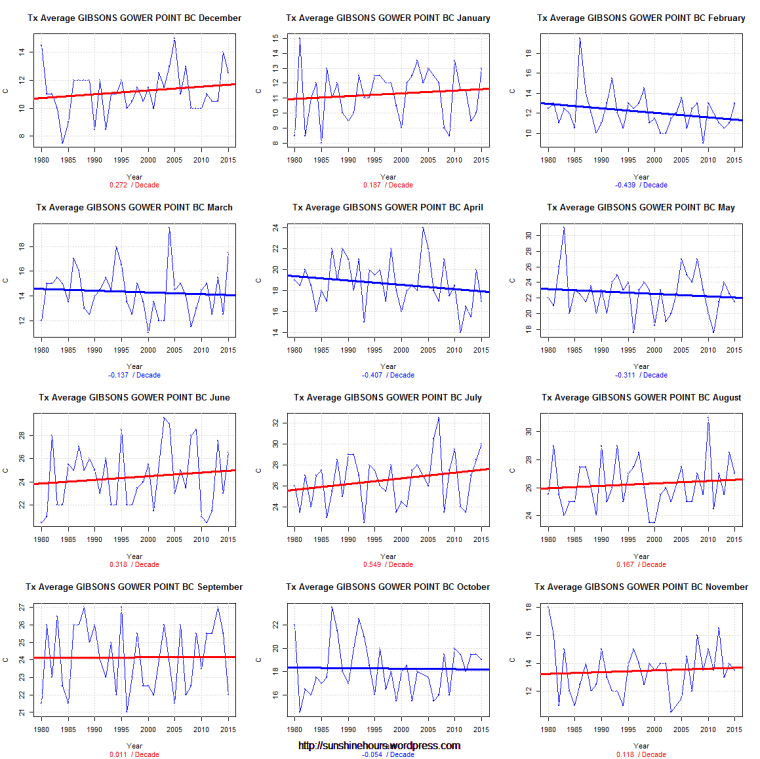
Here are 10 more.
Every once in a while I visit the data for the Canada. Earlier today I looked at the station nearest me (NANAIMO A).
But since I have the code … I thought why not look at 10 random stations that have data in 1980 and 2015.
Today I am looking at TMAX monthly data (using Environment Canada monthly summaries) for 10 random stations from 1980.
Each line of graphs is a season – Dec/Jan/Feb …. etc.


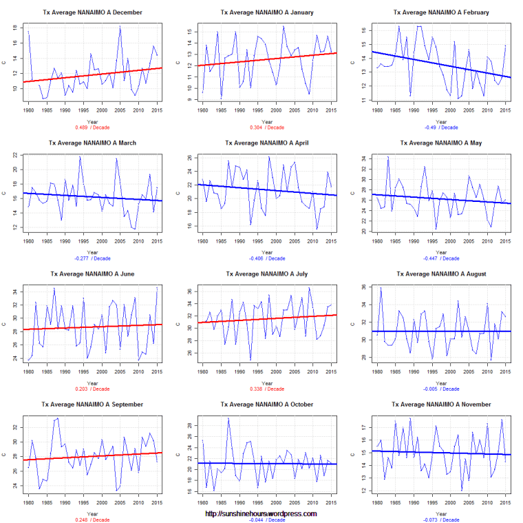
Every once in a while I visit the data for the weather station closest to my hometown on the west coast of Canada.
Today I am looking at TMAX monthly data (using Environment Canada monthly summaries) for NANAIMO A from 1980.
Each line of graphs is a season – Dec/Jan/Feb …. etc.
5 months are warming. 4 are cooling. 3 are cooling ever so slightly.
If there is a CO2 signal in there I am missing it.
The big magic tree con continues. Take millions of trees and select a few that sort of match the temperature records and claim trees are magic thermometers. Never publish the data of the rejected trees. Collect grant money.
“So instead of a validation of the robustness of the data, or the robustness of the field, what we have is is a paper demonstrating the robust willingness of climate scientists to sell trickery as science for both money and for the cause. These authors should be ashamed but even when caught truncating series, they simply push on producing ever more garbage for the small brained sheep in the media, politics and the public to use as propaganda for the government agenda.”
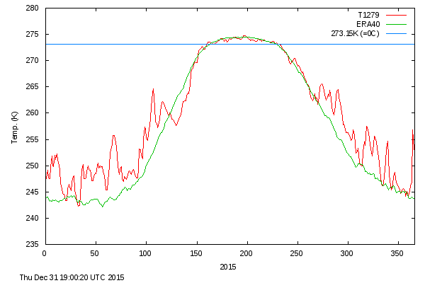
The Washington Post claimed some sort of amazing temperature spike occurred in the Arctic at the end of December.
Never Happened Before!
Yes it has (2015 at bottom). Data is from DMI.
I live near Nanaimo BC (data from 1947 at “NANAIMO A”). I was curious what the temperature range for any given day would be.
By temperature range I mean find the warmest it has ever been for a particular day and then subtract the coldest it has ever been.
December 1st , February 4th, November 14th and May 16 have the biggest range = 32.8C.
November 18th has the lowest range = 16.9C. (I find it interesting it has never been colder than -4.4C on November 18 when it has been -16.1C on November 14th.
(Remember this when someone says humans and animals will notice a 1C change in the next 100 years).
Top 10 and bottom 10 below.
Biggest Difference:
| Month | Day | Min | Max | Difference |
| 12 | 1 | -18.9 | 13.9 | 32.8 |
| 2 | 4 | -16.7 | 16.1 | 32.8 |
| 11 | 14 | -16.1 | 16.7 | 32.8 |
| 5 | 16 | -4.4 | 28.4 | 32.8 |
| 6 | 17 | 0.6 | 33.3 | 32.7 |
| 5 | 29 | 1.7 | 34.3 | 32.6 |
| 5 | 12 | 0 | 32.4 | 32.4 |
| 5 | 28 | 0.6 | 33 | 32.4 |
| 5 | 14 | -0.6 | 31.7 | 32.3 |
| 12 | 24 | -13.9 | 18.2 | 32.1 |
Lowest Difference:
| Month | Day | Min | Max | Diffference |
| 11 | 18 | -4.1 | 12.8 | 16.9 |
| 3 | 15 | -3.3 | 14.5 | 17.8 |
| 12 | 5 | -7.1 | 12.1 | 19.2 |
| 11 | 10 | -4.4 | 14.9 | 19.3 |
| 12 | 11 | -6.1 | 13.5 | 19.6 |
| 12 | 3 | -5.9 | 14 | 19.9 |
| 12 | 12 | -6.3 | 13.9 | 20.2 |
| 2 | 23 | -5.6 | 14.6 | 20.2 |
| 3 | 14 | -3.9 | 16.6 | 20.5 |
| 3 | 17 | -5 | 15.7 | 20.7 |
Is everything the AGW cult told us turned out to be false?
“Acidic water may be a sign of healthy corals, says a new study, muddying the waters still further on our understanding of how coral reefs might react to climate change.
Andreas Andersson of the Scripps Institution of Oceanography in San Diego, California, and his colleagues carefully monitored a coral reef in Bermuda for five years, and found that spikes in acidity were linked to increased reef growth.
“At first we were really puzzled by this,” says Andersson. “It’s completely the opposite to what we would expect in an ocean-acidification scenario.””