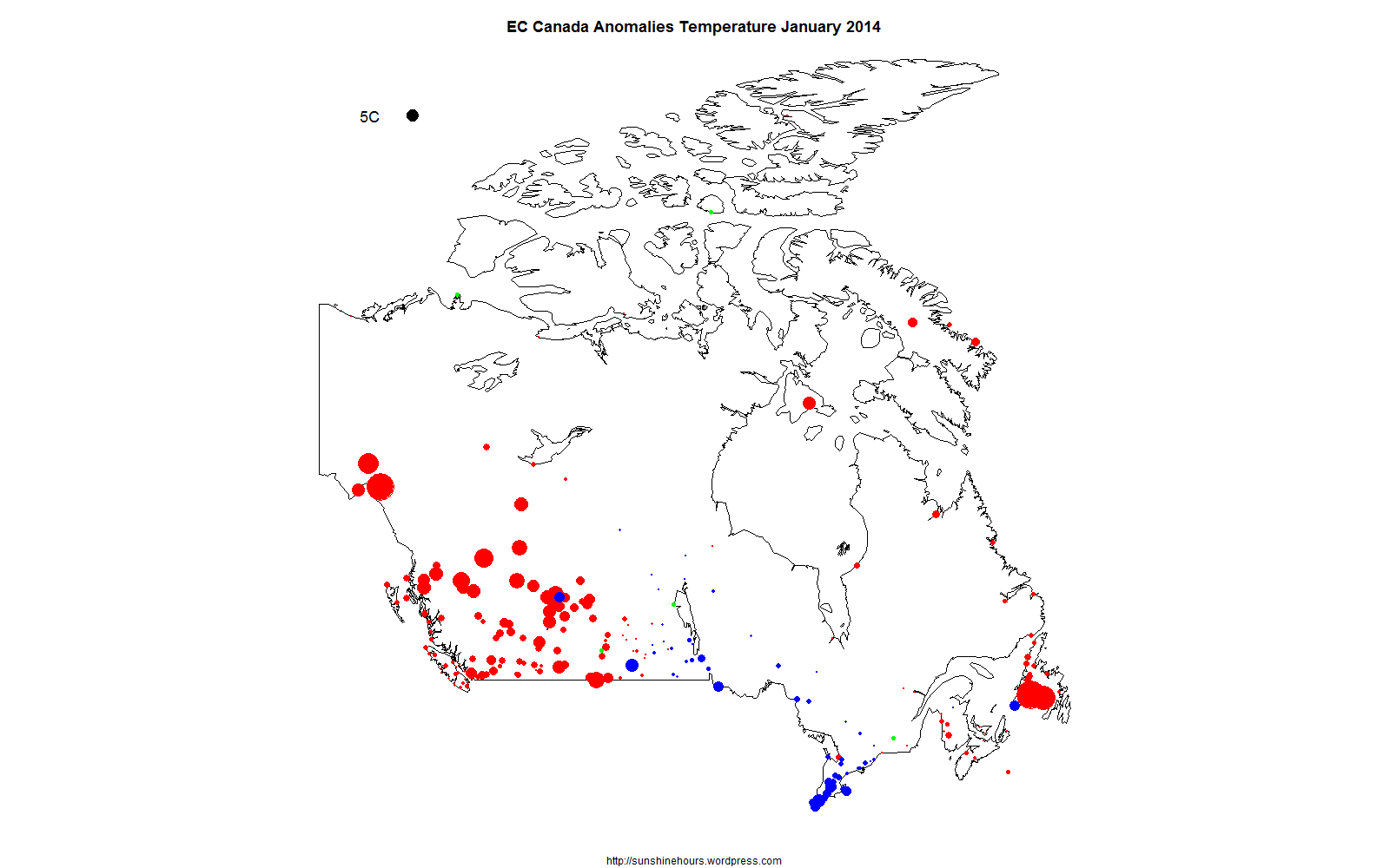
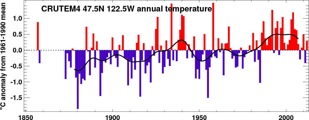
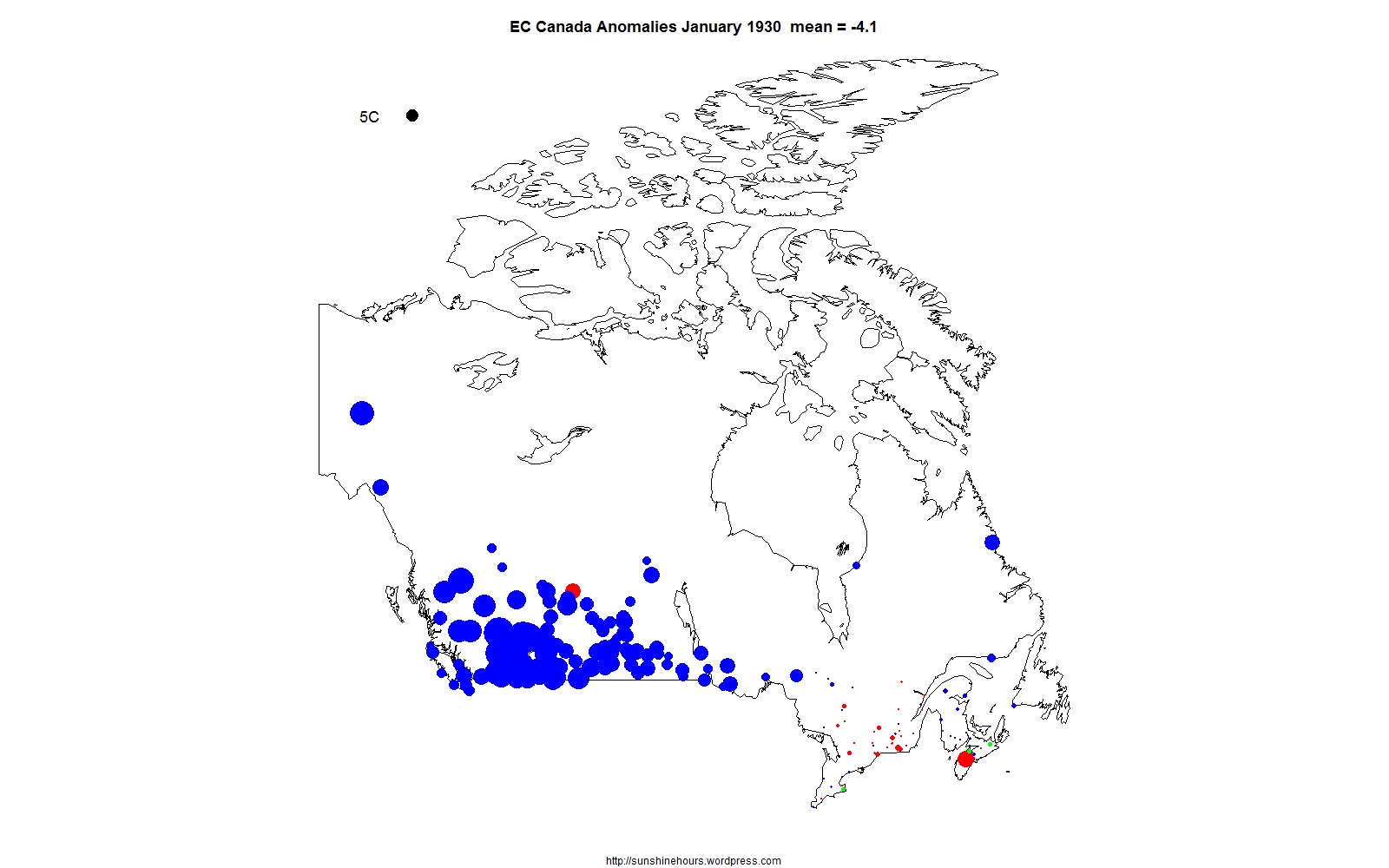
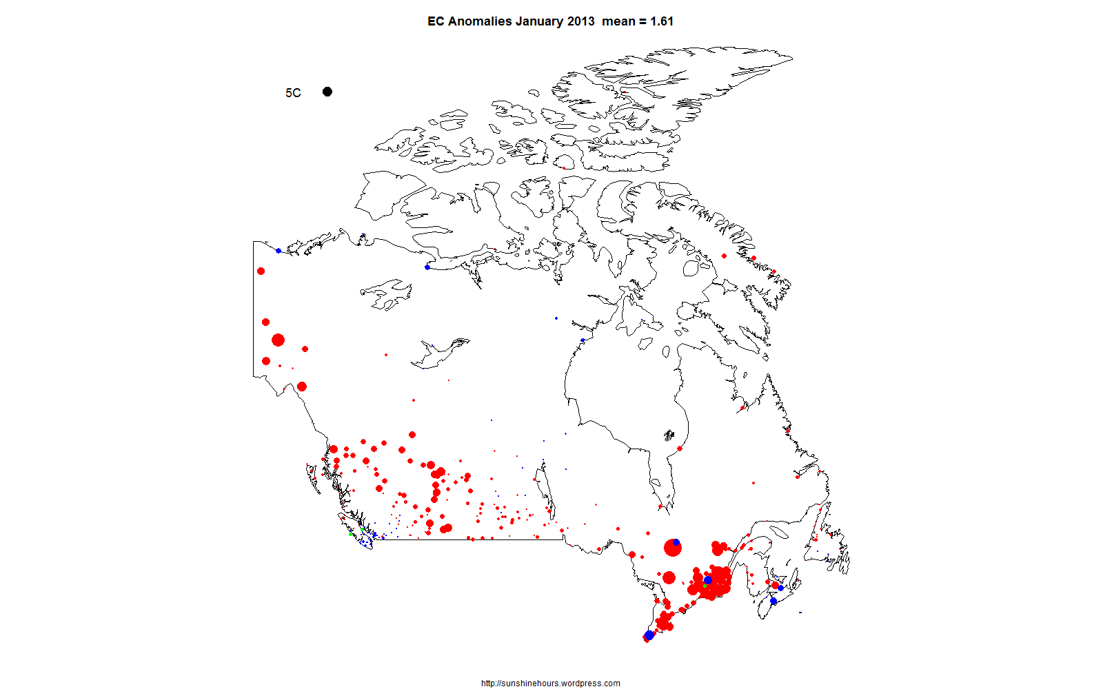
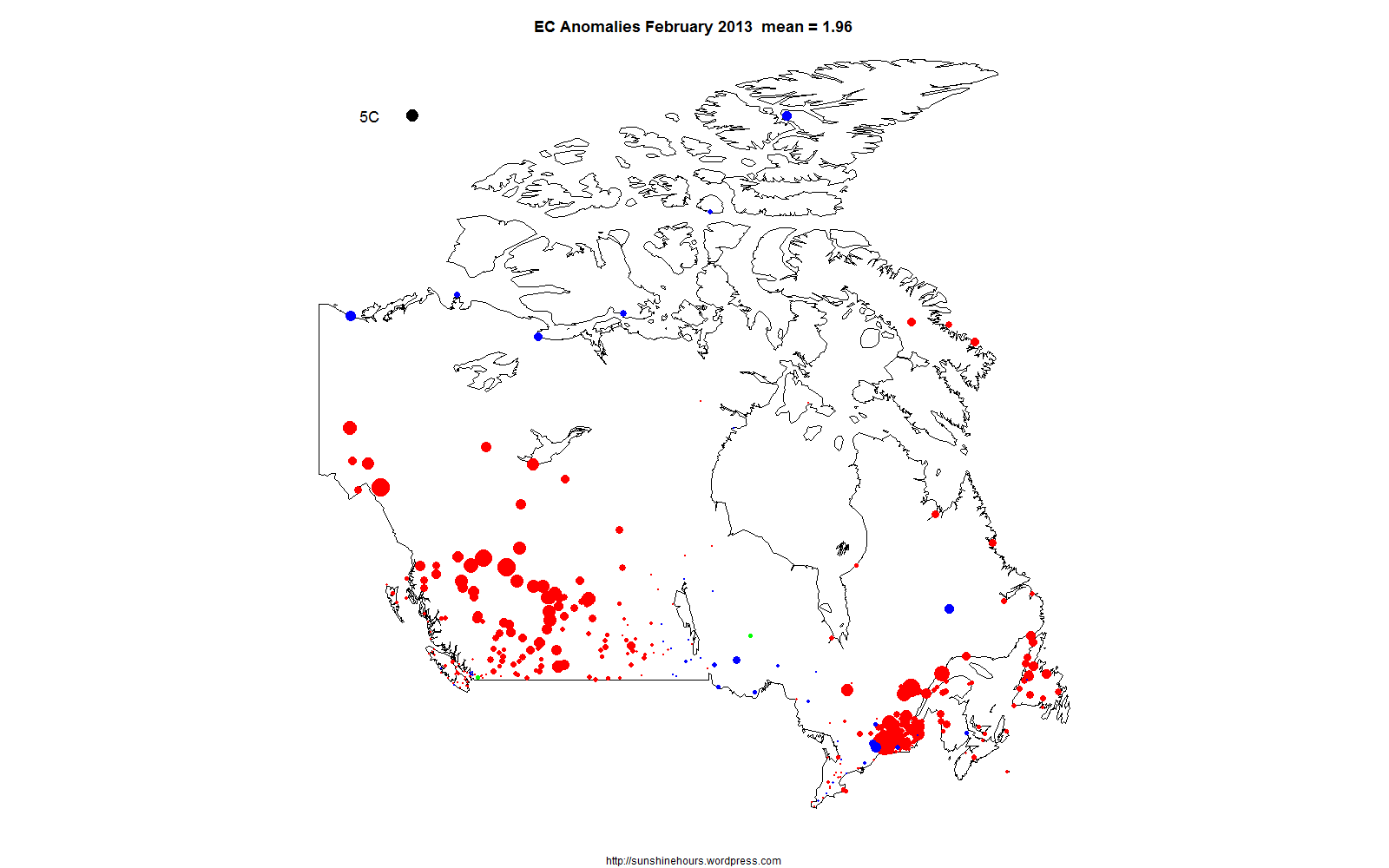
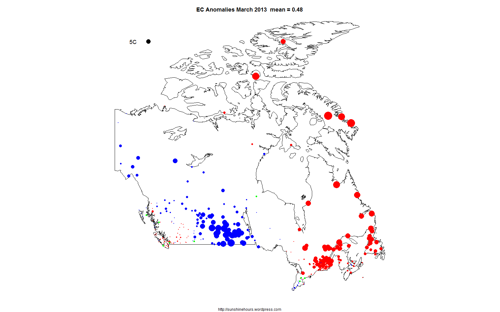
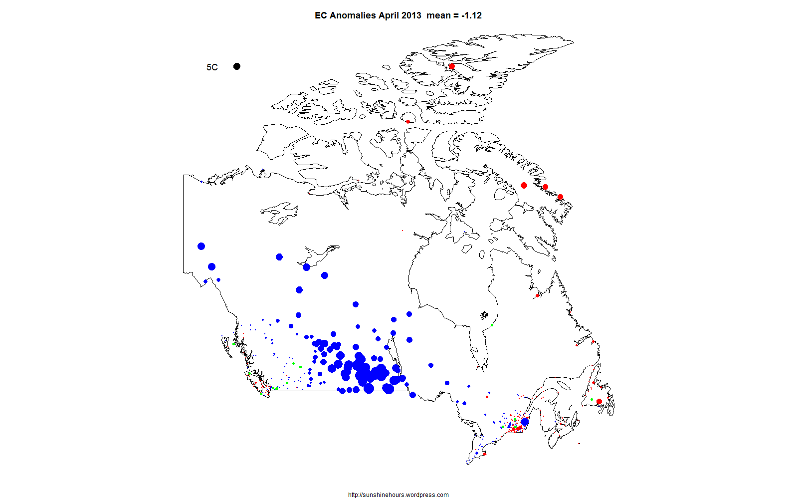
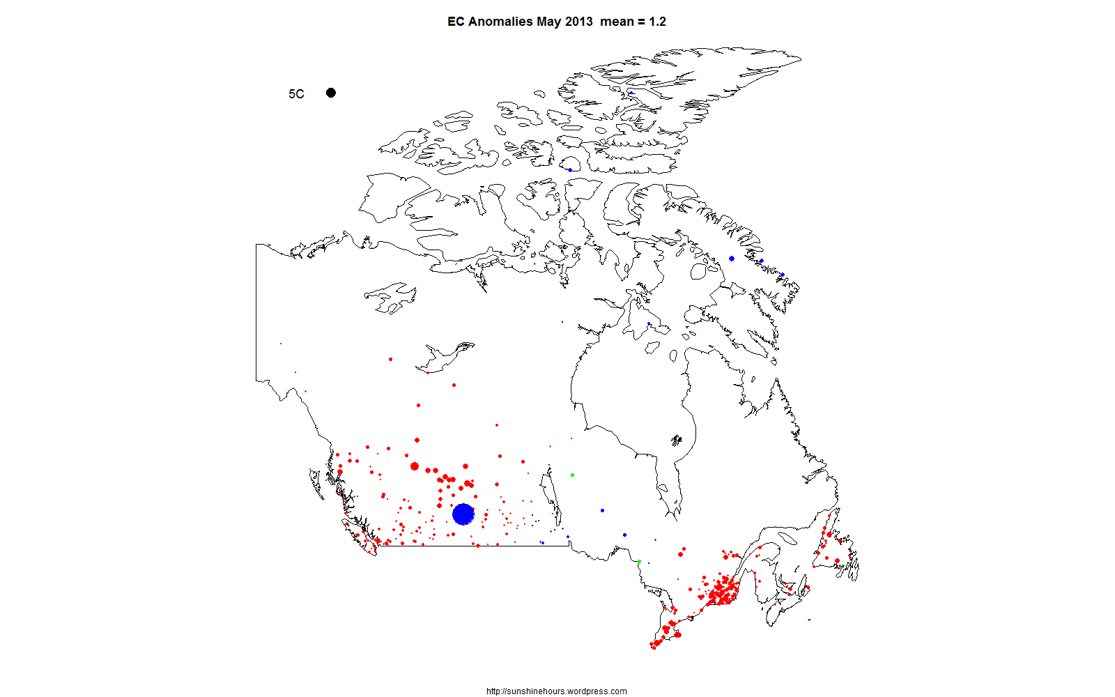
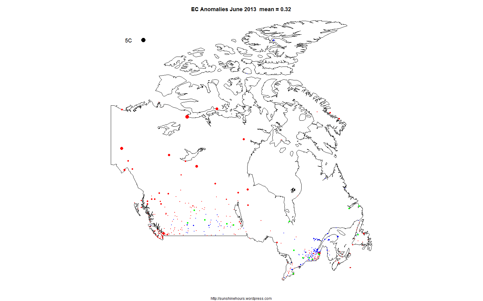
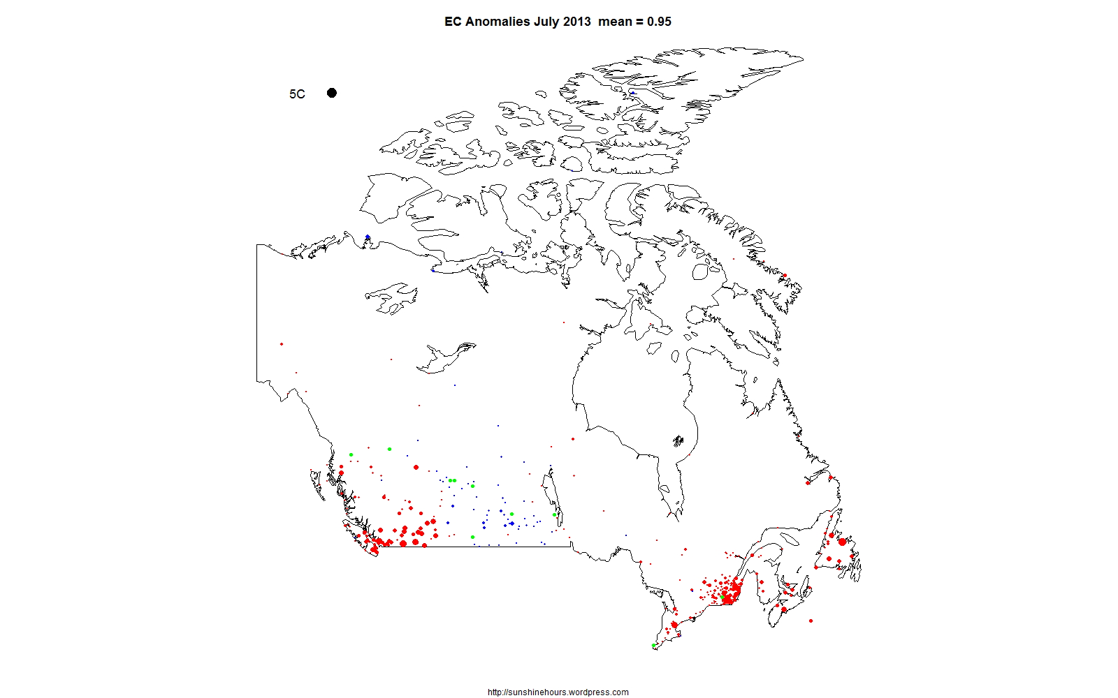
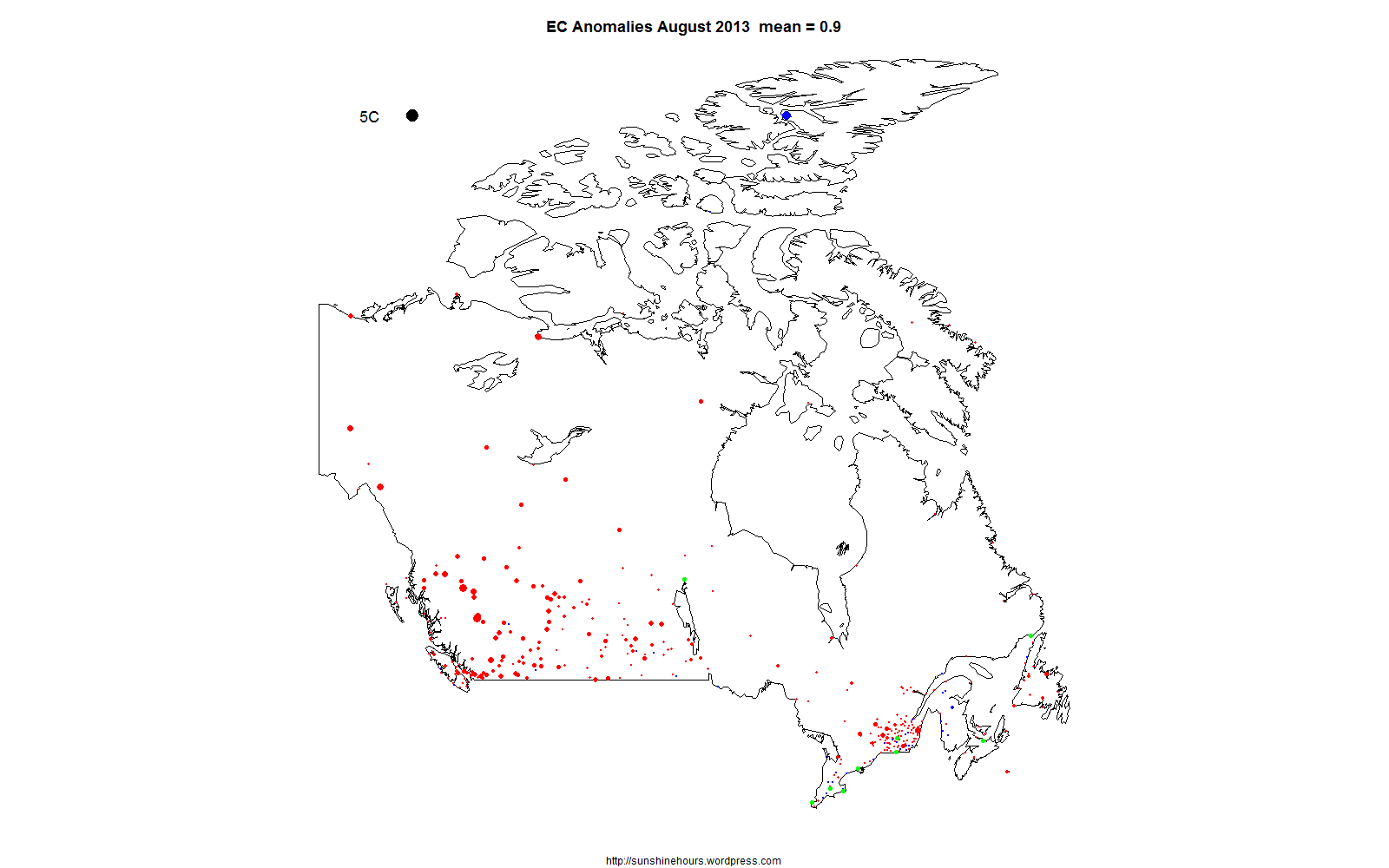
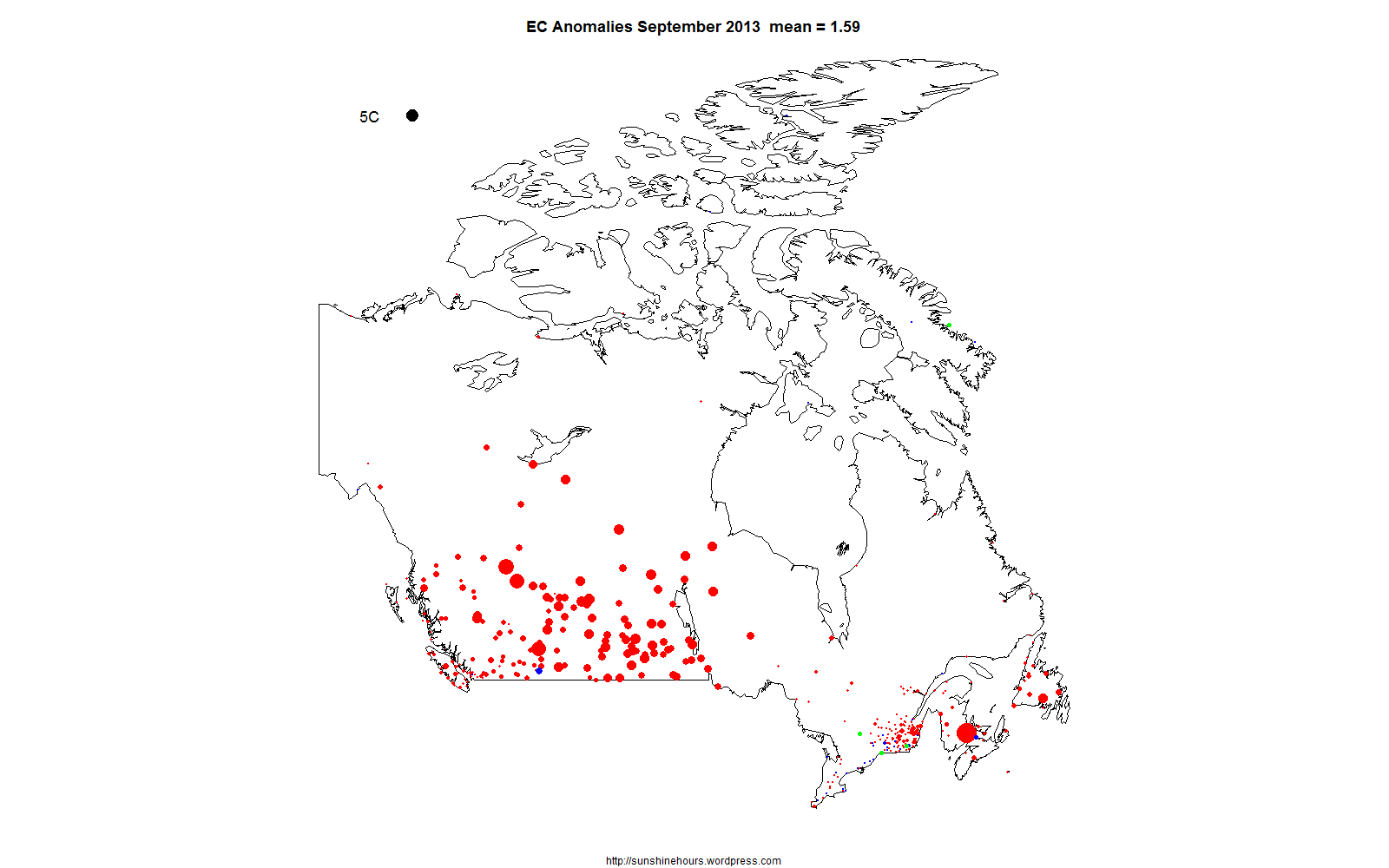
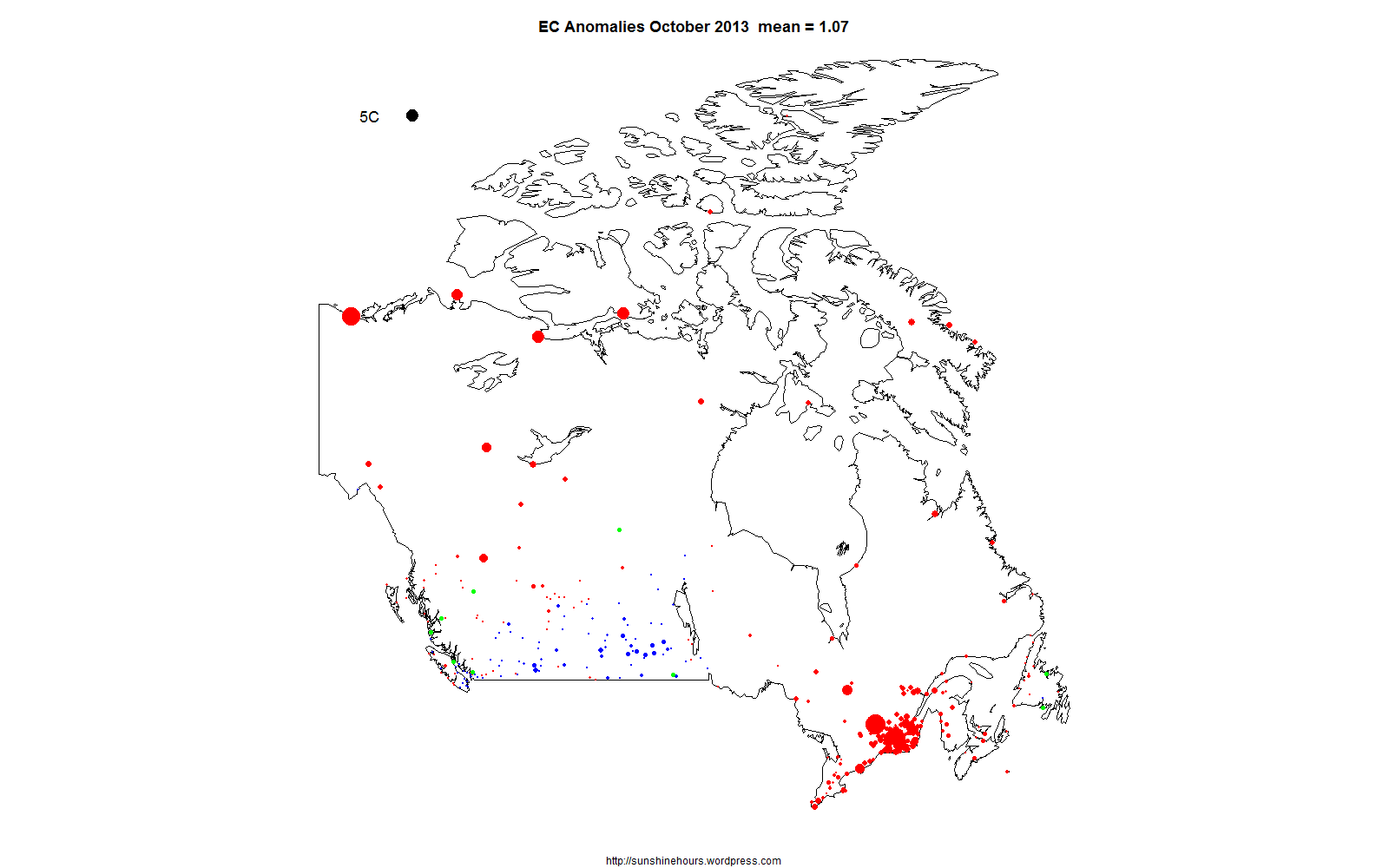
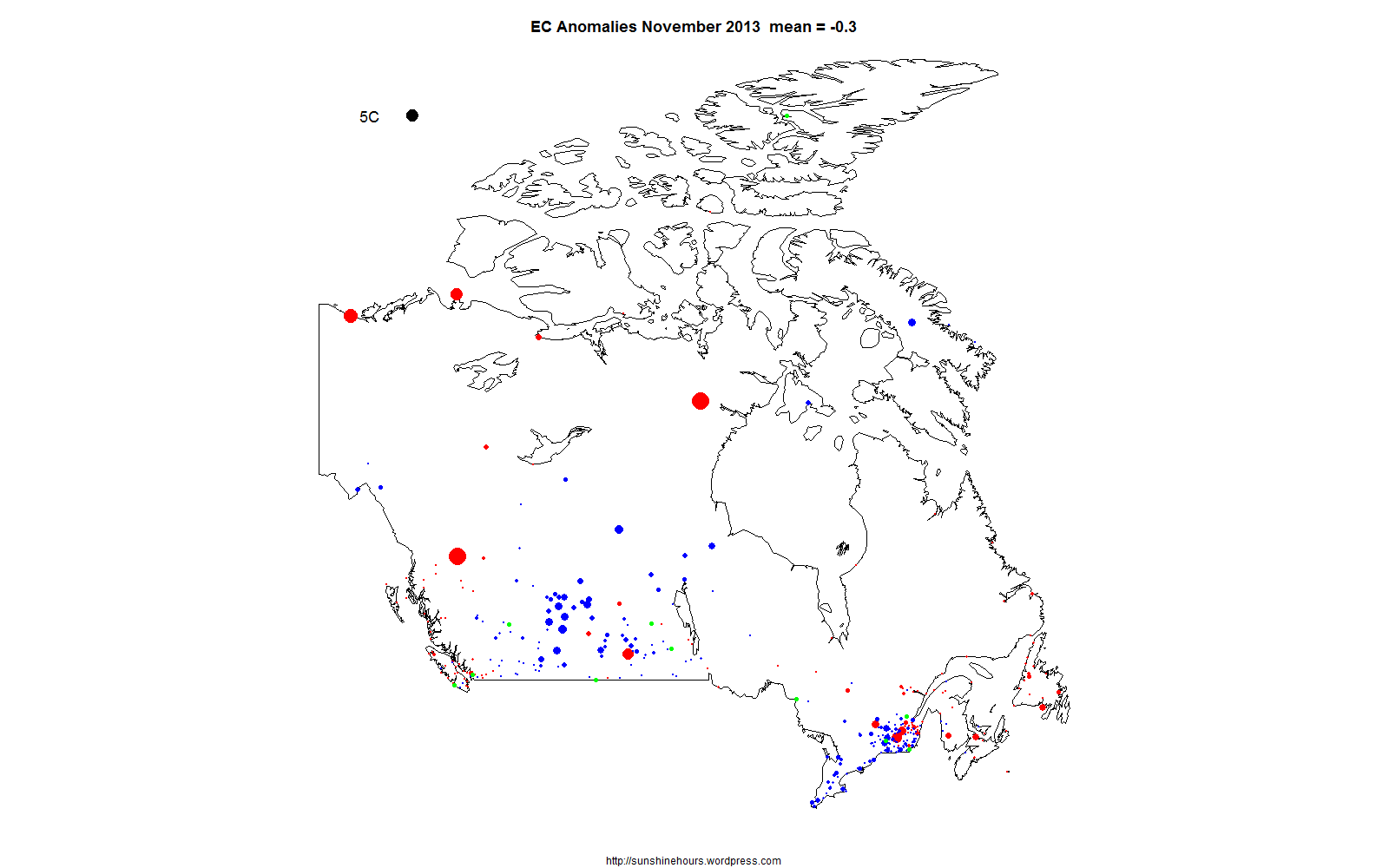
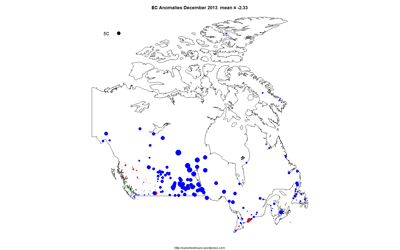
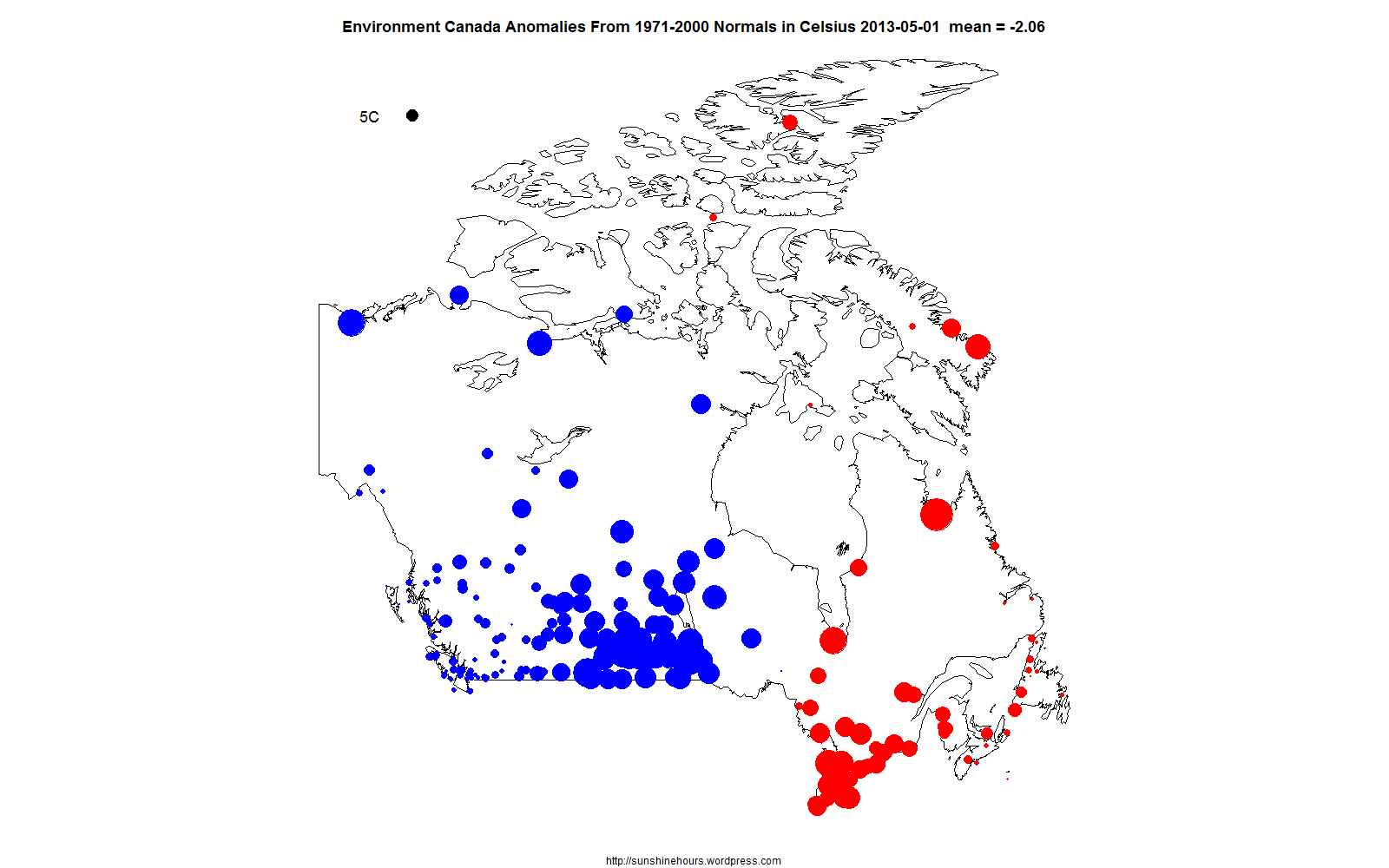
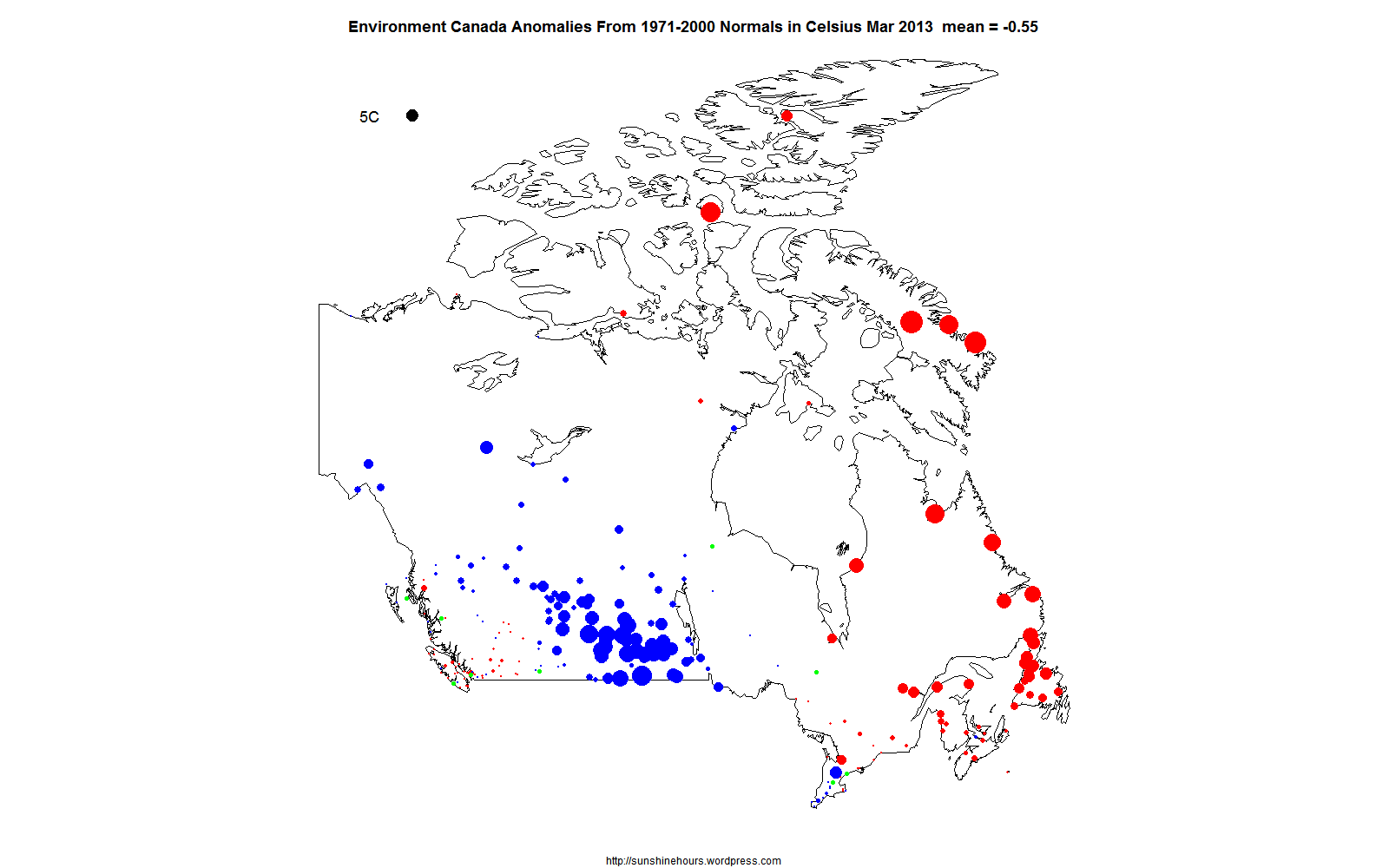
I have mapped the January 2014 anomalies in the Environment Canada monthly summaries that have “normals”. The anomalies are calculated from selected stations based on the 1971-2000 average.
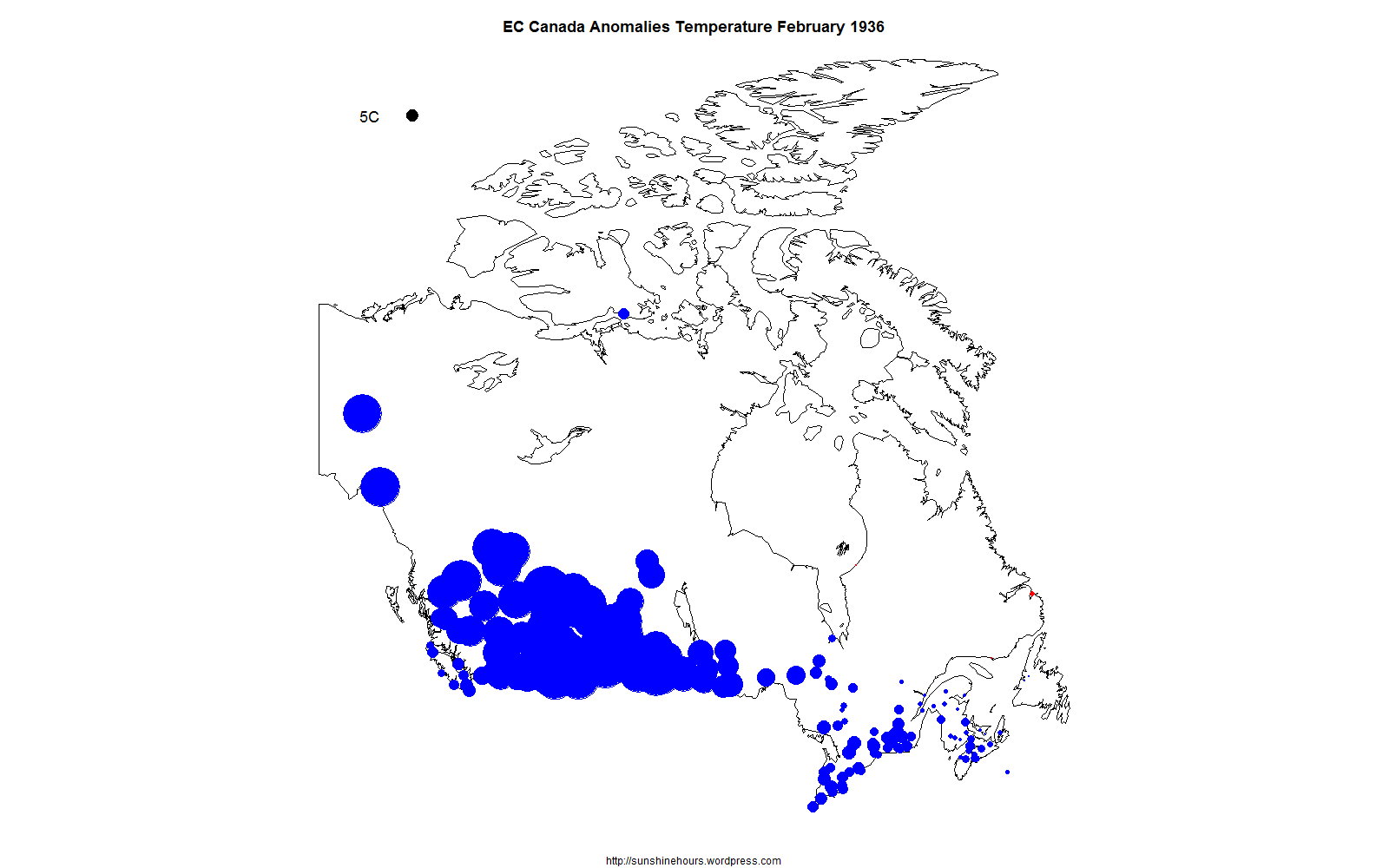
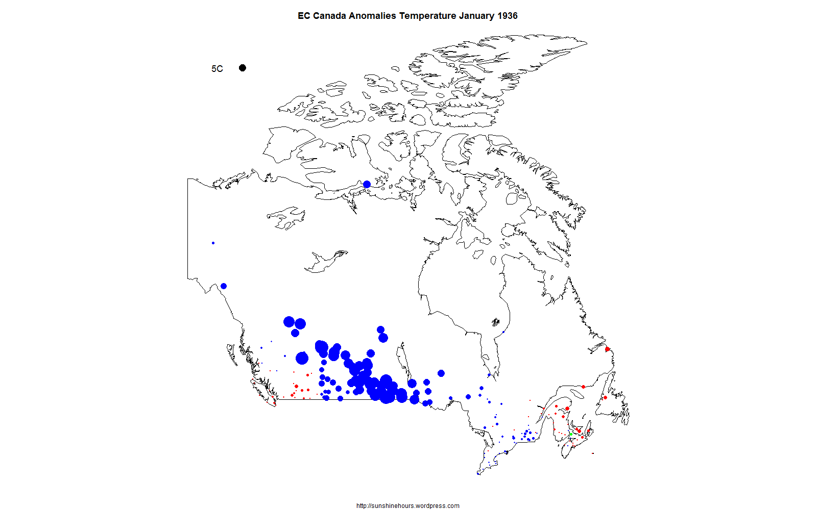
The size if the dot represents the size of the anomaly. The 5C black dot in the top left hand corner represents 5C difference from “normal”. Red dots are warmer than normal. Blue are cooler. And Green are 0.
Not much sign of the Polar Vortex in BC and Alberta for January. A big change from December.


