According to the NOAA, for Arkansas July 2014 ranked 2nd coldest out of 120 using the Maximum temperature.
It was -5.8F below the 1901-2000 average. Only .1F warmer than 1905.

According to the NOAA, for Arkansas July 2014 ranked 2nd coldest out of 120 using the Maximum temperature.
It was -5.8F below the 1901-2000 average. Only .1F warmer than 1905.
According to the NOAA, July 2014 ranked 29th coldest out of 120 using the Maximum temperature
The list in order of warmest to coldest.
1936,1934,1901,2012,2006,1931,1980,1954,1930,2011,2002,1933,2003,1939,2005,1966,1935,1988,1998,1917,1964
1937,1952,1943,1910,1921,1940,1919,1957,1960,1974,1977,1953,1925,2007,1932,1985,1942,1914,1955,1970,1946
1916,1949,2001,1959,2008,1989,2010,1983,1929,1941,1978,2000,1951,1999,1963,1926,1969,1938,1991,1923,1944
1981,1947,1994,1995,1897,2013,1948,1961,1996,1898,1899,1956,1908,1973,1900,1928,1922,1975,1986,1945,1984
1920,1913,1896,1927,1976,1997,1987,2014,1911,1918,1968,1979,1990,1982,1971,1965,1924,2009,1967,2004
1907,1909,1906,1958,1902,1962,1972,1903,1912,1905,1904,1993,1895,1950,1915,1992
The scary thing is … 2009 and 2004 were colder than 2014.
28,504 Low Max Records were set in last 365 days according to the NOAA.
A “Low Max” means that the maximum temperatures for the day was the lowest it has ever been.
This indicates daytime cooling.
Only 13205 High Max records were set. That is over a 2:1 ratio. Brrr.

(h/t IceAgeNow)
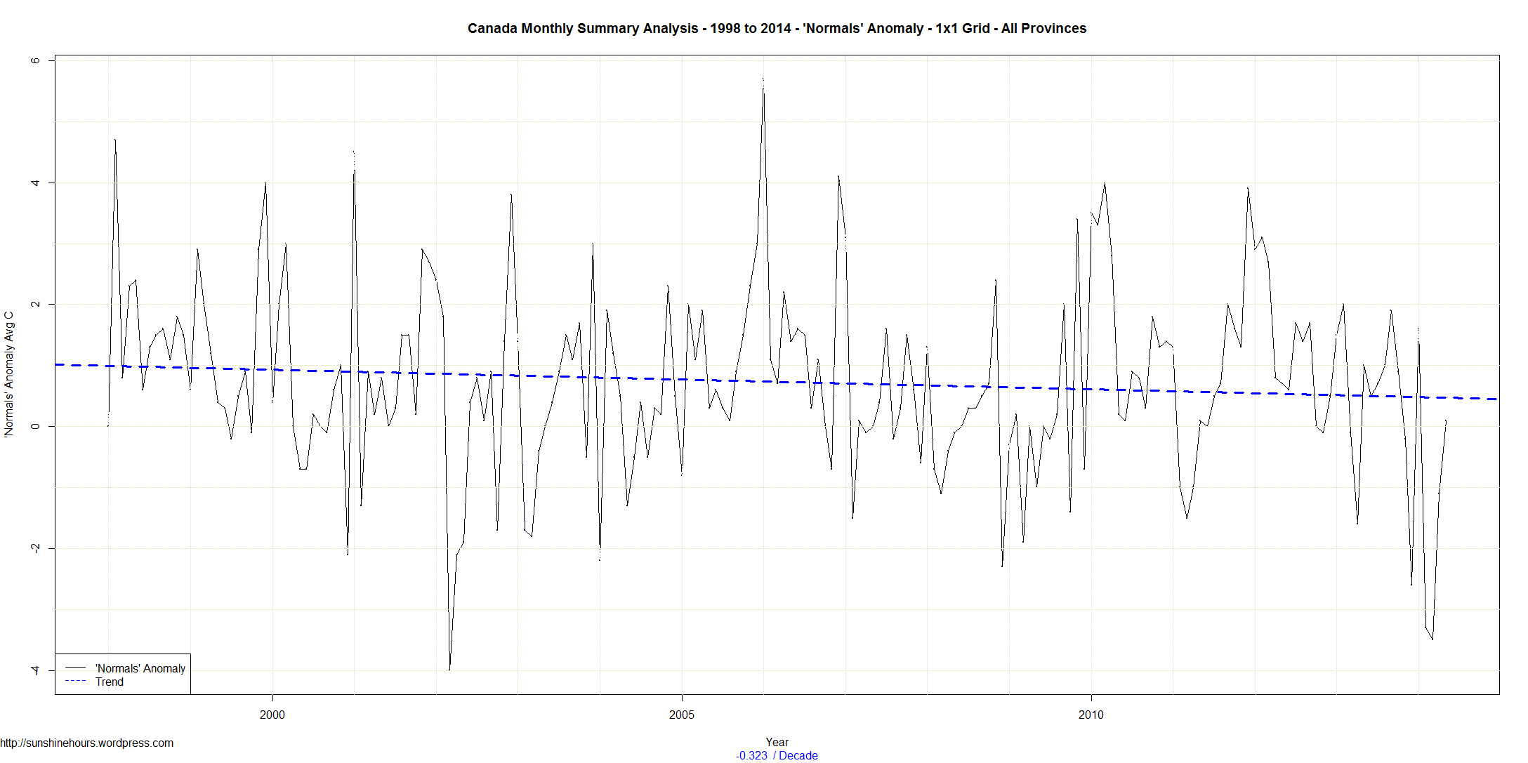
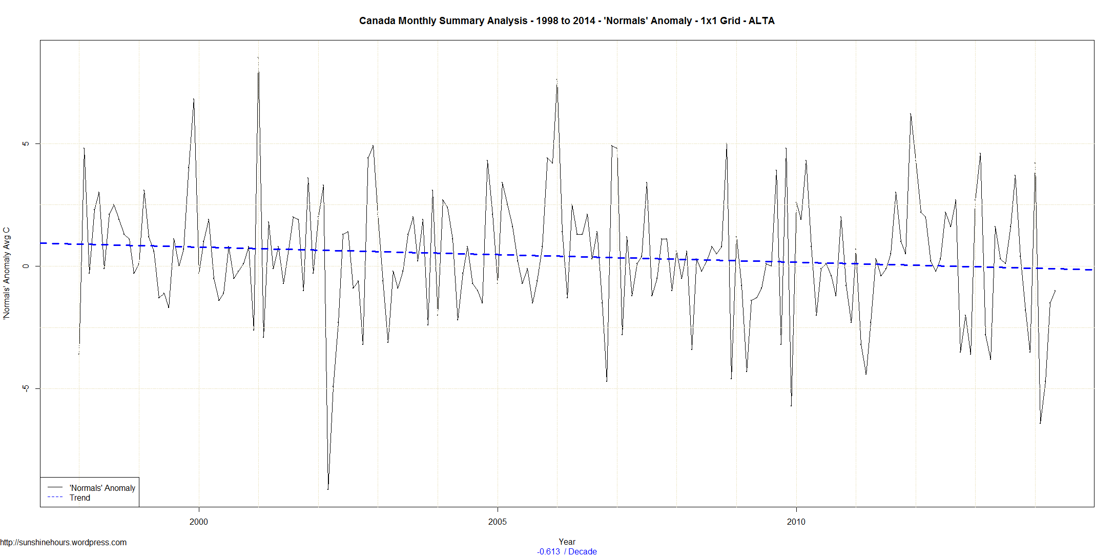
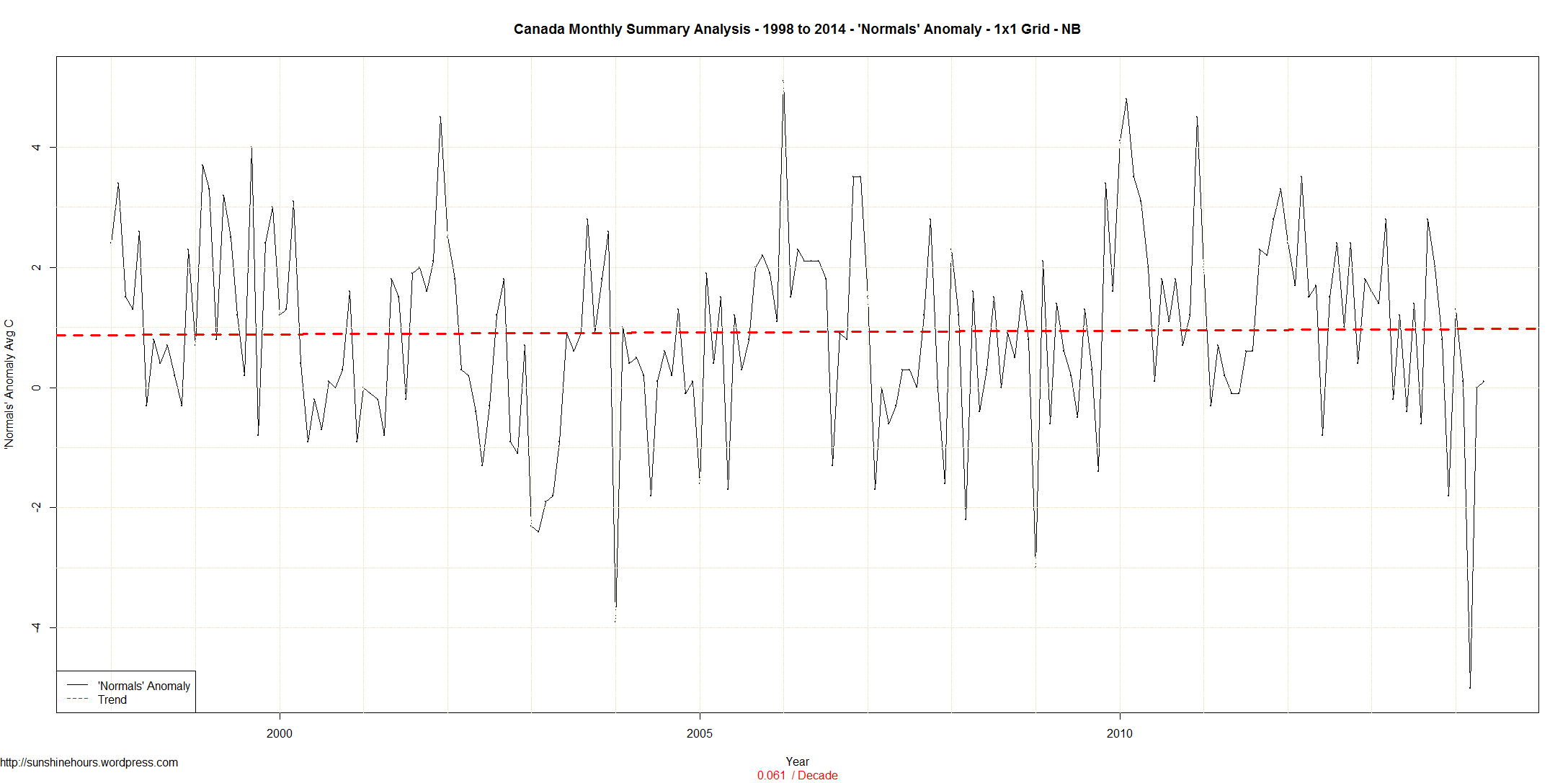
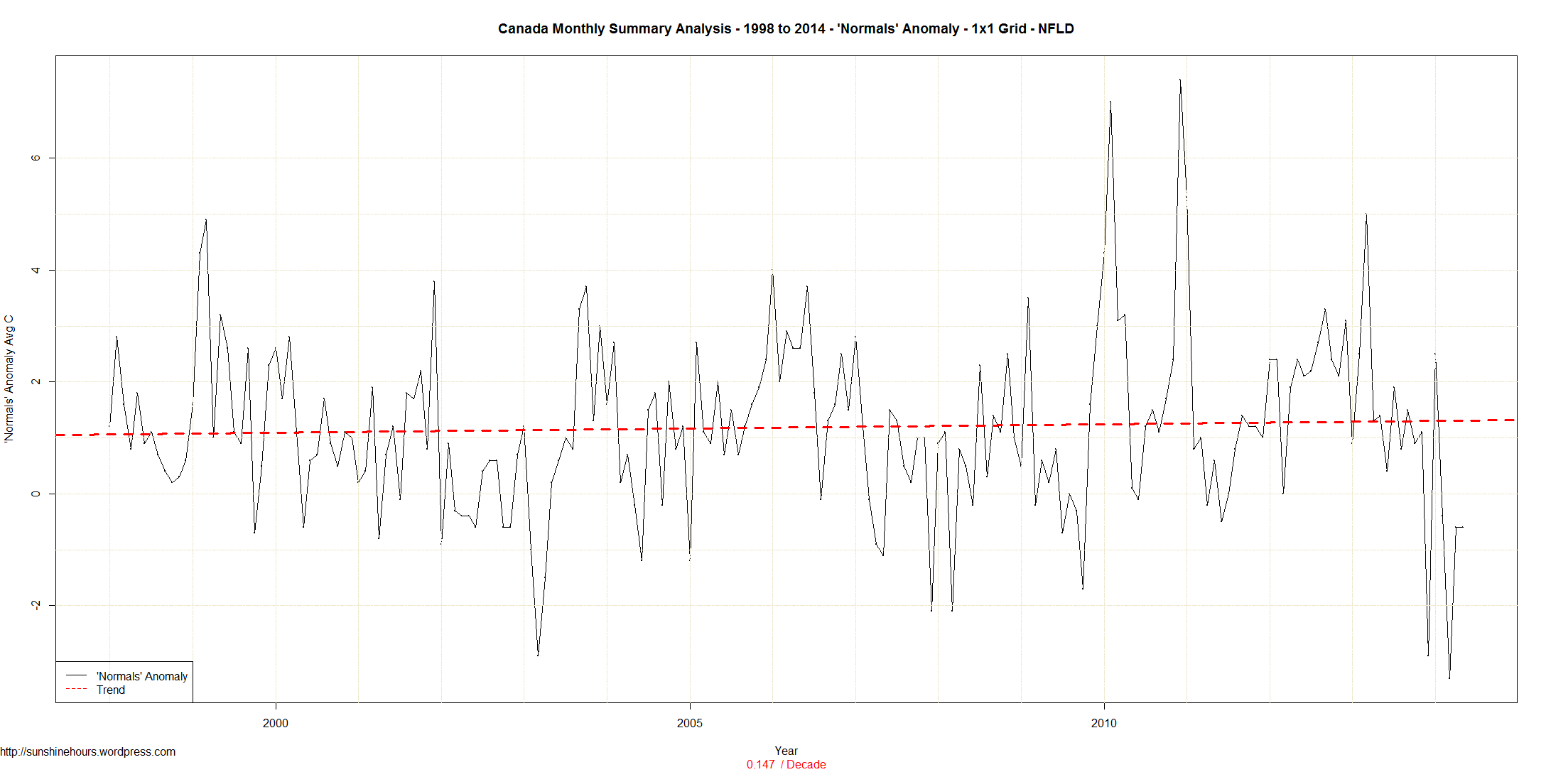
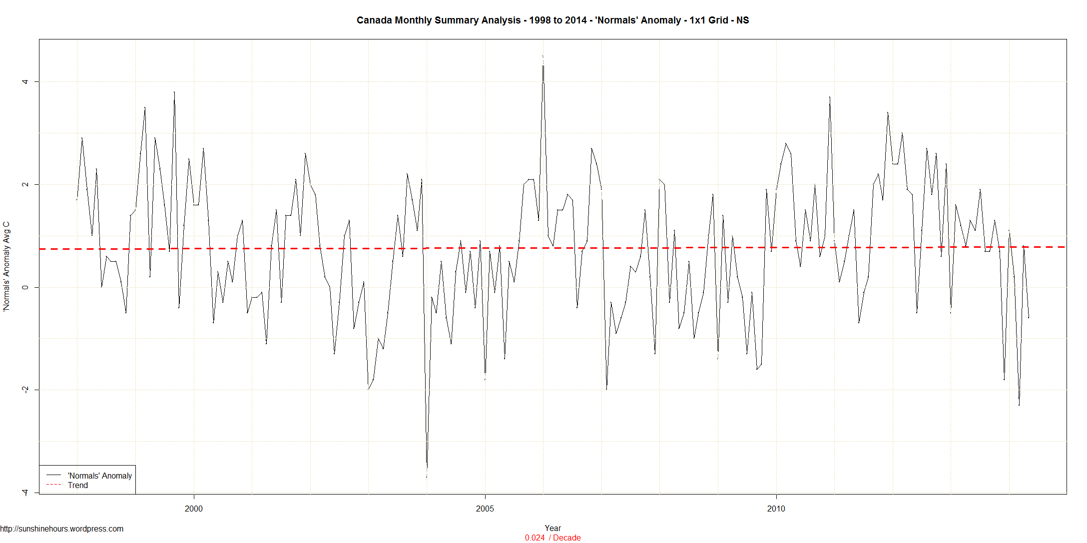
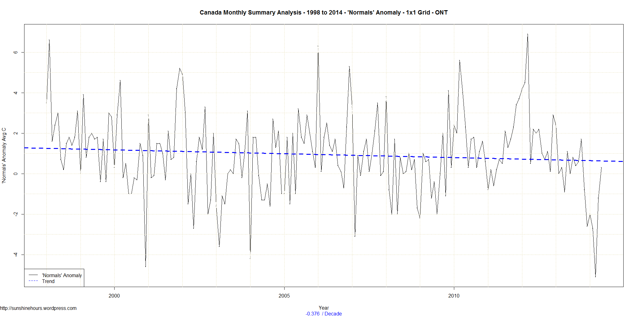
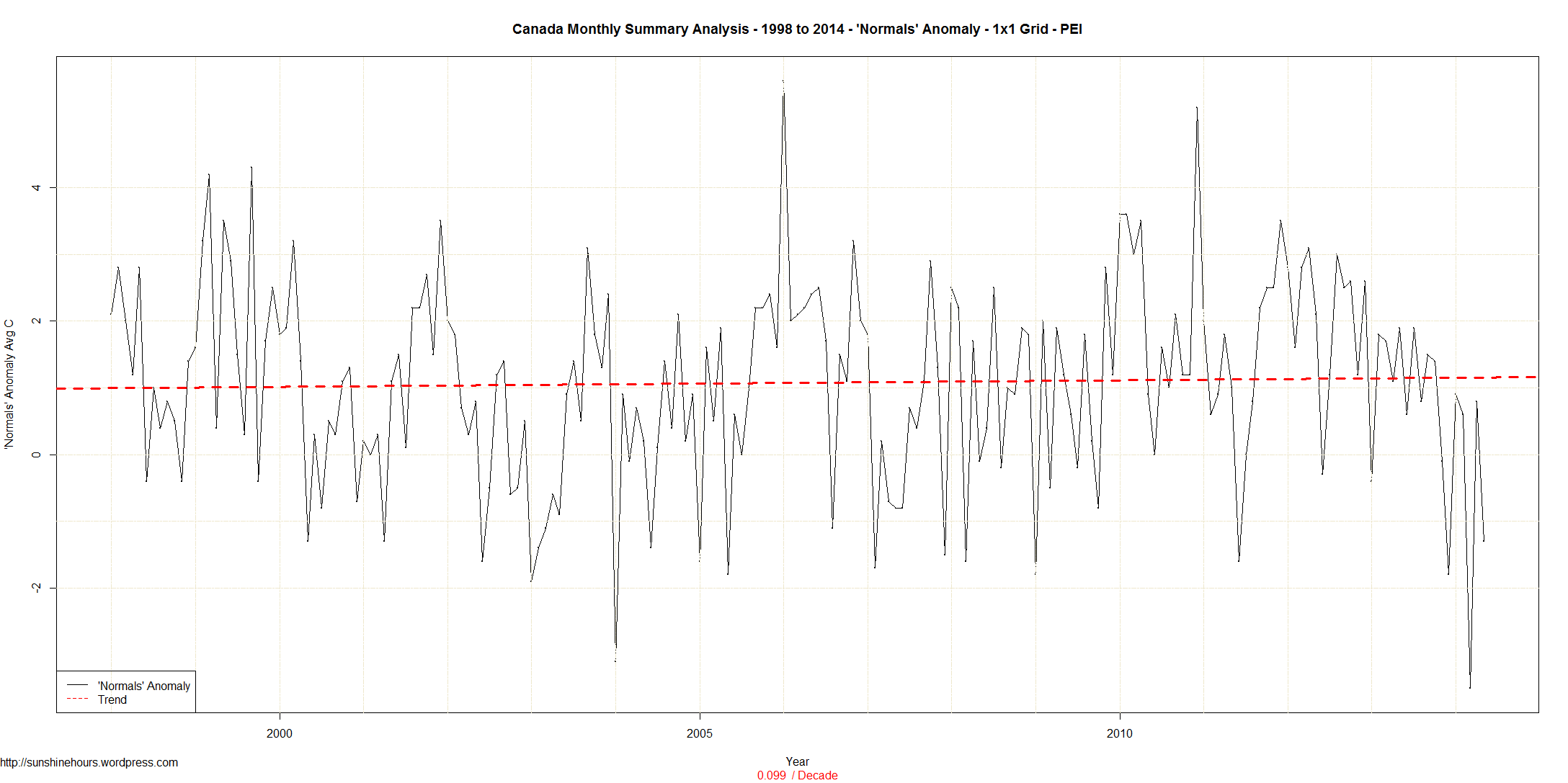
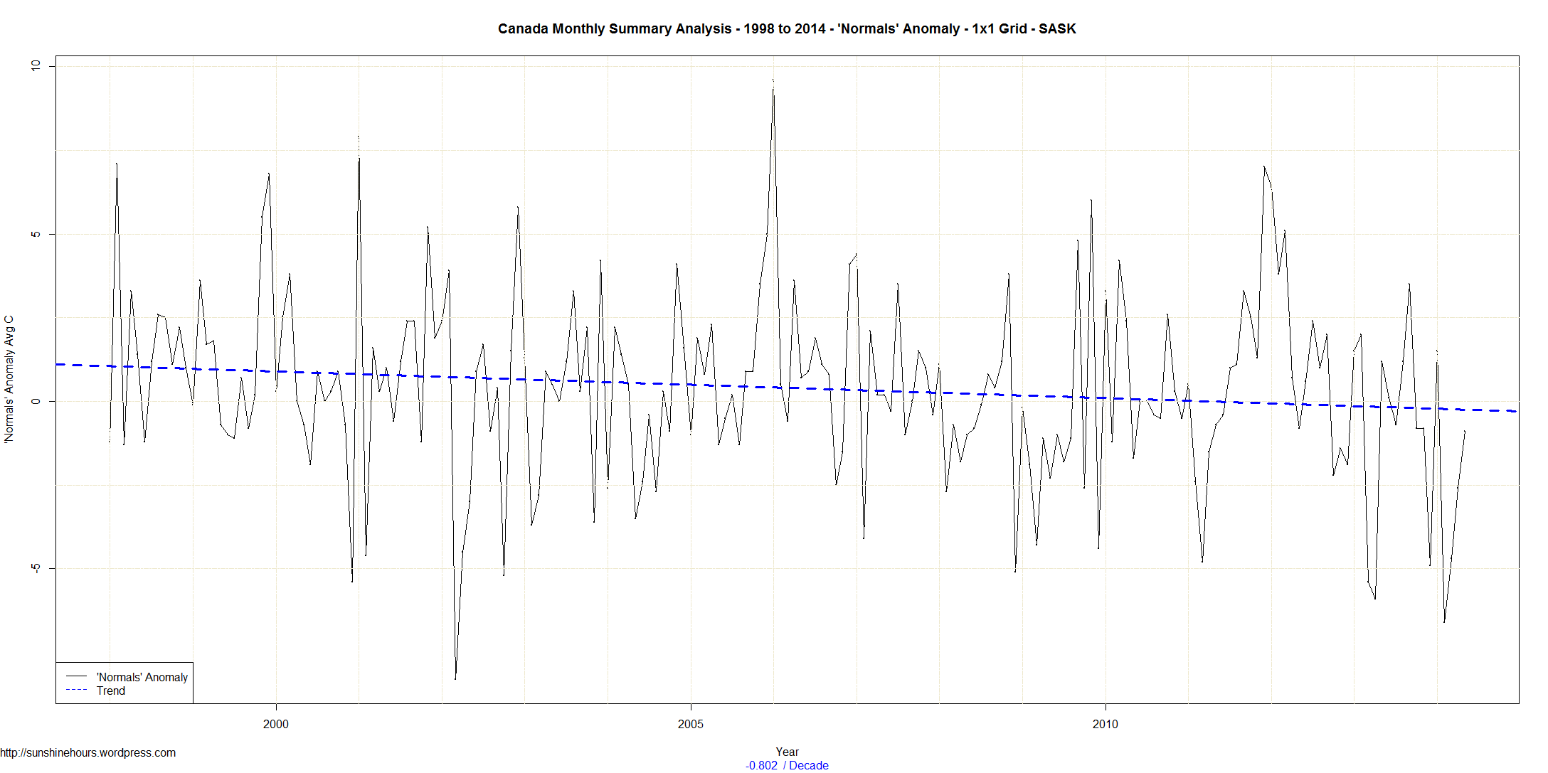
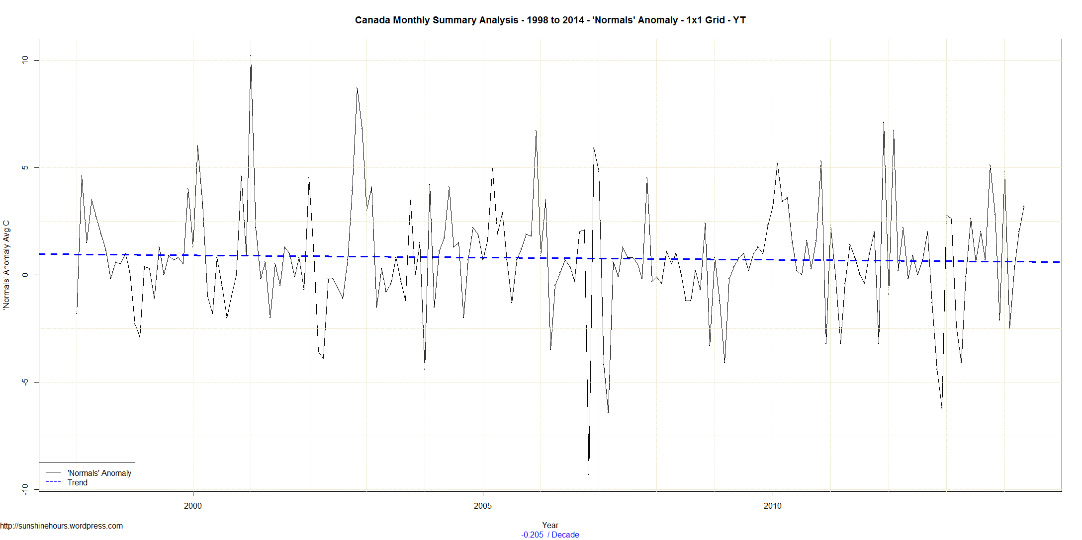
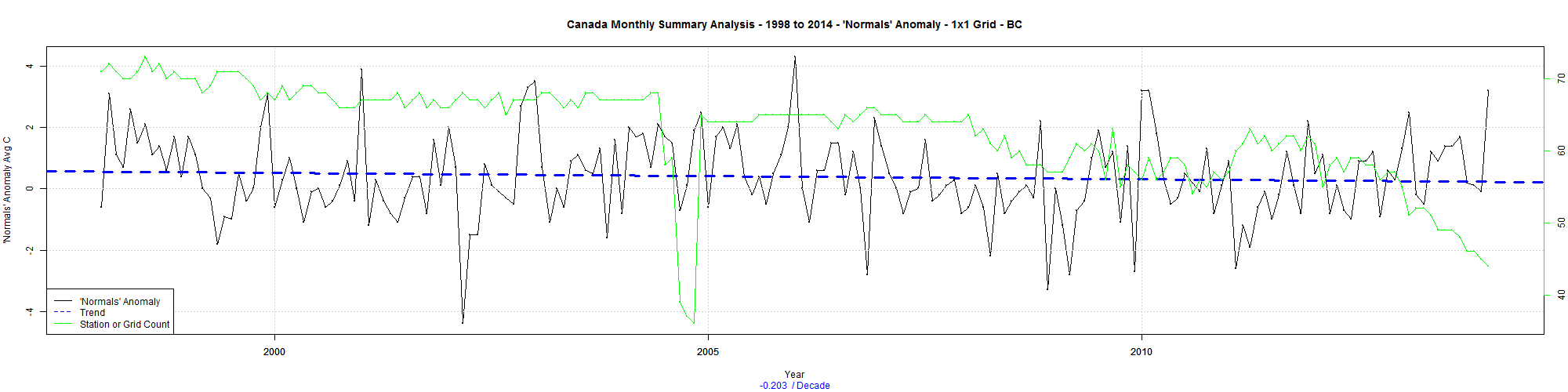
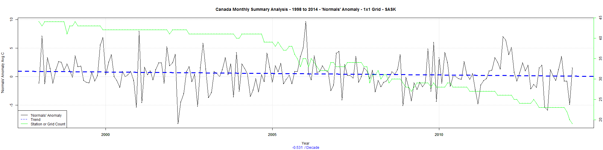
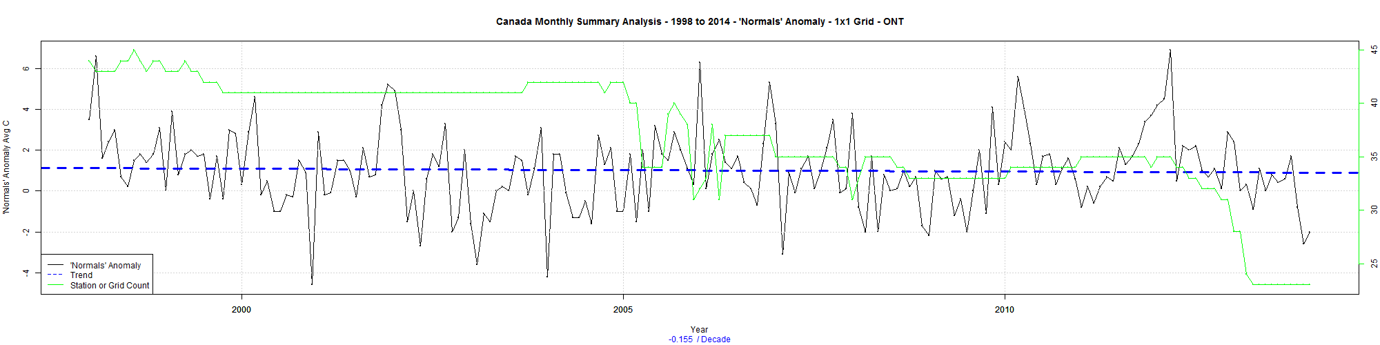
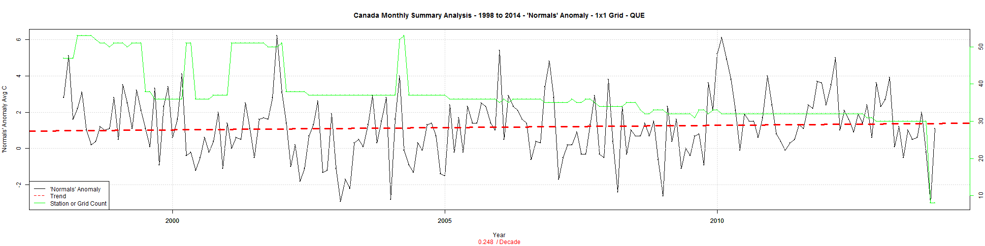
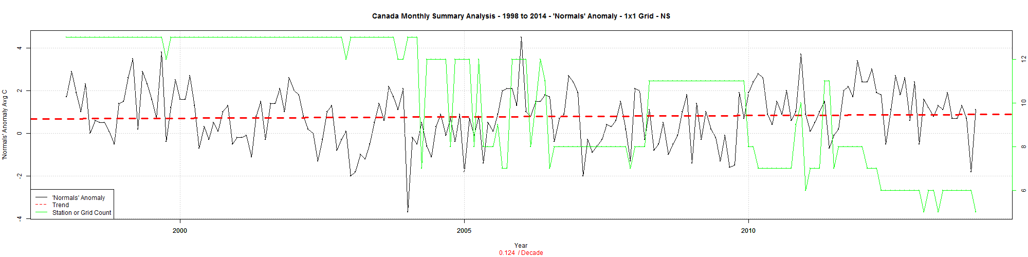
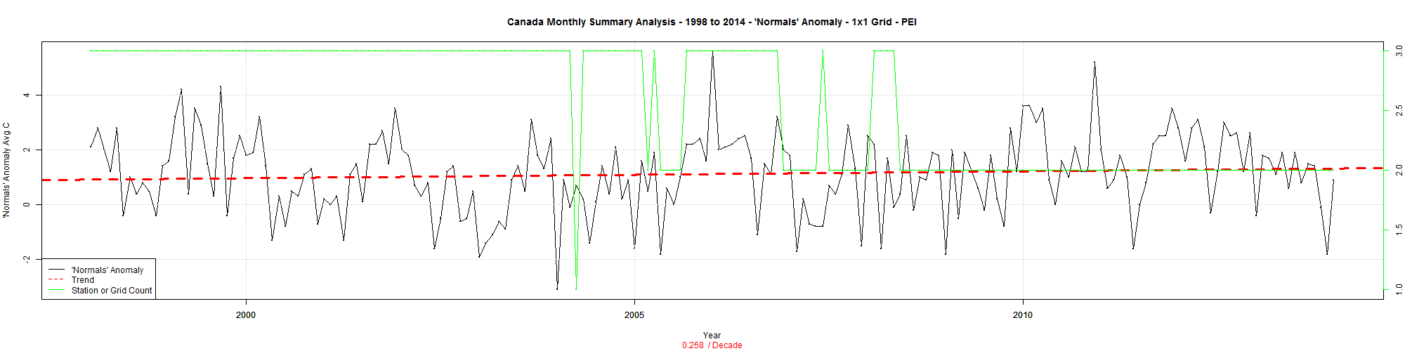
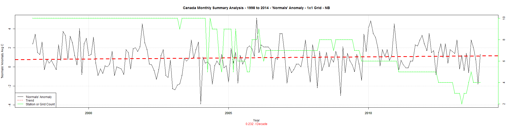
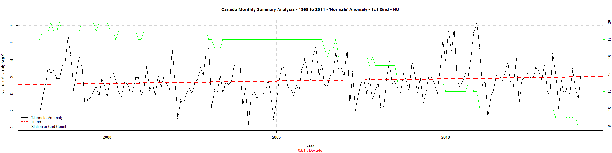
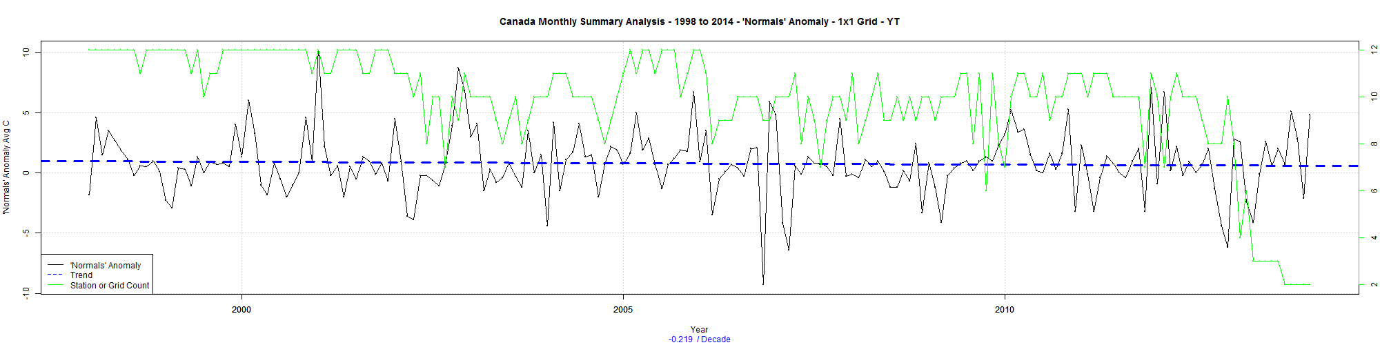
Environment Canada publishes monthly summaries here. The data included Tmax, Tmean, Tmin and Normals (the D column). The Normals column is “Mean Temperature difference from Normal (1971-2000) (°C)”. These are supposedly the higher quality stations. Only some of the stations get a Normals value.
I could just look at the stations with Normals and summarize the data. But some of the stations are close together. So I thought why not summarize the data by 1×1 grid square and then summarize the grid squares.
Correction: I left the green line out of these graphs – The green line is the count of grid squares with data in them. That is dropping like a stone. (I will discuss this in another post).
And why not see what happens from 1998. We know 1998 is a pivot point in climate.
The trend for the whole country from 1998 is cooling at -0.32C/decade. Saskatchewan and Manitoba are cooling at over -.8 C /decade. Wow.
Here are the trends for each province.
All Provinces -0.32 C/decade
ALTA -0.61
BC -0.3
MAN -0.86
NB 0.06
NFLD 0.15
NS 0.02
NU 0.47
NWT -0.36
ONT -0.38
PEI 0.1
QUE 0.01
SASK -0.8
YT -0.21
And here are the graphs for each province and then one more for the whole country. Click For bigger.


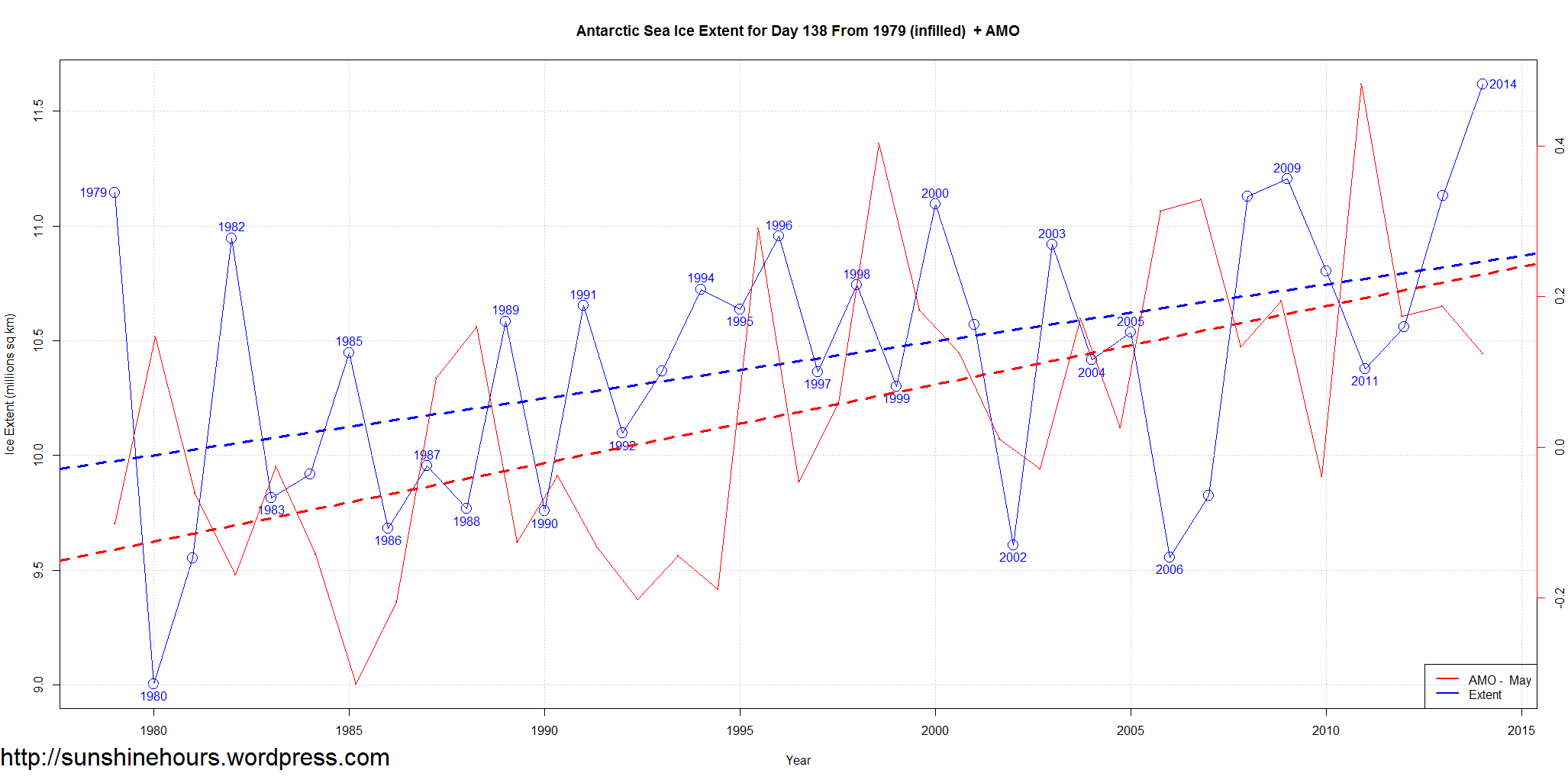
The graph is in thise post compares sea ice extent for just one day of each year – 138 to the AMO for the month day 138 is in – in this case May. There isn’t any AMO data for May 2014 yet.
AMO data comes from NOAA, Sea Ice data comes from NSIDC.
The red is the May AMO – Atlantic Multidecadal Oscillation. The blue is Antarctic Sea Ice Extent just for day 138.
The dashed lines are the liner trends for each.
Click on the graph for a larger size.
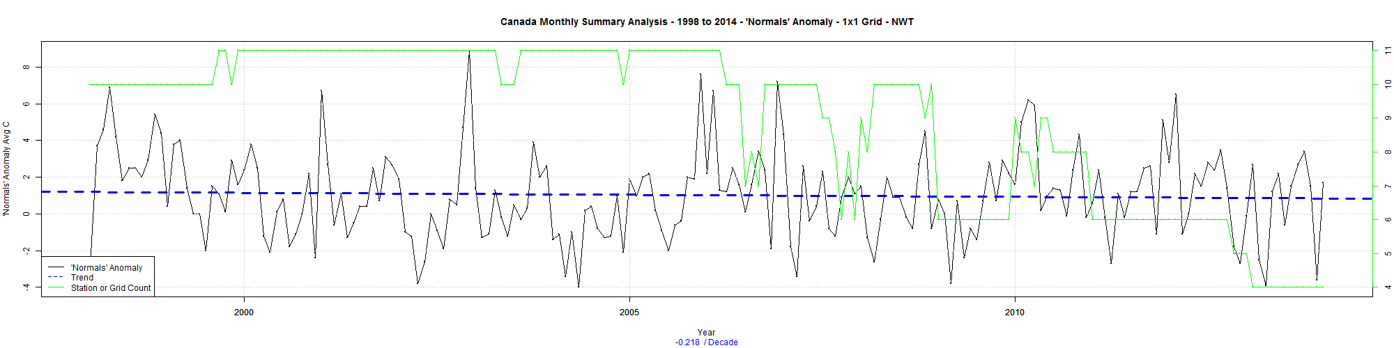
Environment Canada publishes monthly summaries here. The data included Tmax, Tmean, Tmin and Normals (the D column). The Normals column is “Mean Temperature difference from Normal (1971-2000) (°C)”. These are supposedly the higher quality stations. Only some of the stations get a Normals value.
I could just look at the stations with Normals and summarize the data. But some of the stations are close together. So I thought why not summarize the data by 1×1 grid square and then summarize the grid squares. The green line is the count of grid squares with data in them. That is dropping like a stone. (I will discuss this in another post).
And why not see what happens from 1998. We know 1998 is a pivot point in climate.
The trend for the whole country from 1998 is cooling at -0.13C/decade. The big surprise is Ontario. The last time I did this it was warming. Here are the trends for each province.
All  -0.13
BC   -0.20
ALTA -0.35
SASK -0.53
MAN  -0.56
ONT  -0.13
QUE   0.25
NS    0.12
NB    0.23
NFLD  0.35
PEI   0.26
NWT  -0.22
YT   -0.22
NU    0.54
And here are the graphs for each province and then one more for the whole country. Click For bigger.


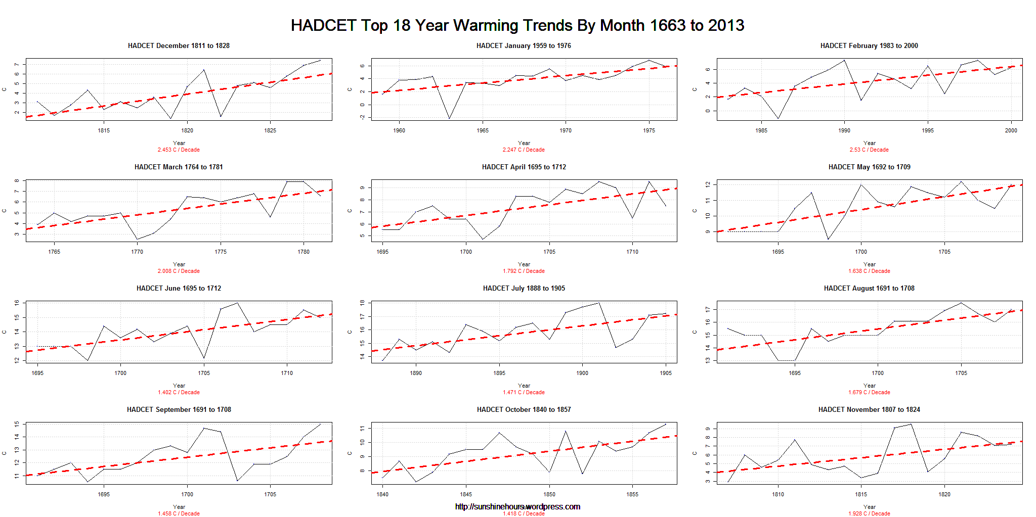
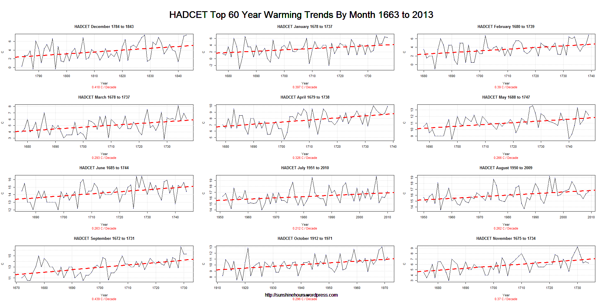
The other day I did a post about HADCET data by month showing how some of the months have a 350 year flat trend.
The next day I did a post about the top 18 year warming trends at anytime in the 350 year history of HADCET.
How about 60 years? Surely the key period in global warming propaganda is 1950 on. You might expect them all to be around 1950 to 2000 or so wouldn’t you? Well, if you believe in global warming you might. But if you haven’t been taken in, you might not.
Well, only two months (July and August) were from the modern era. October was close, but 1912 to 1971 doesn’t fit the AGW cult criteria.
Eight of the months started the trend in the 1600s. One in the 1700s.
So much for CO2 as the cause of “unprecedented warming”. The warming was for the most part very precedented.
Click for a bigger graph.
Antarctic Sea Ice Extent data has been unavailable for a few days. I emailed NSIDC and today they replied and said:
“Occasional short-term delays and data outages do occur and are usually resolved in a few days. We are currently experiencing such a short-term delay and we will get the issue resolved as quickly as possible.”
Commenter Gary also posted a link to this page that says:
“October 25, 2013: Daily updates to the graph and image are temporarily suspended due to technical difficulties with the data provider.”
Yesterday I did post about HADCET data by month showing how some of the months have a 350 year flat trend.
Today I thought I would look at the top 18 year warming trends at anytime in the 350 year history of HADCET. Why 18 years? Well, 1980 to 1998 was 18 years.
You might expect them all to be around 1980 to 1998 wouldn’t you? Well, if believe in global warming you might. But if you haven’t been taken in, you might not.
Only one recent month made it in the top. February 1983 to 2000. 2.53C per decade. Helped by the 5th coldest February in 1986 and the 3rd warmest February in 1998. That was an 8C rise.
But the next closest was January 1959 to 1976. And five of the trends start in the 1600s! One in the 1700s. And four in the 1800s.
There is nothing unusual about the warm in the 1980s to 1990s.
Click for a bigger graph.